Hello typhophiles!
This is my first post in this forum so I'll go ahead with a quick presentation.
I'm a graphic design graduate. I'm cultivating my obsession with typography and I guess I've found here the best place to worsen my compulsion.
I've been lurking for a while and I found this site an indispensable (and beautiful) resource.
Asking mercy for my bad English and type terminology I'll go ahead with my first rant:
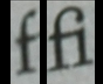
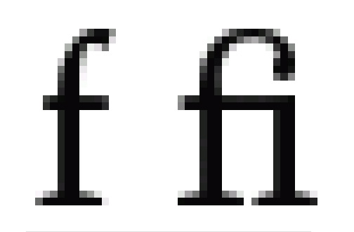
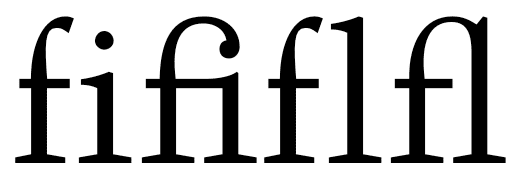
I have been reading "Musicophilia" by Oliver Sacks for 5 weeks, I think it's interesting and easy to follow book but I still stop reading when my eyes meet ligatures in the text particularly the "fi" glyph. Also footnotes are often spreading into multiple pages breaking my flow of thoughts.
Here are some photos explaining what I'm talking about.
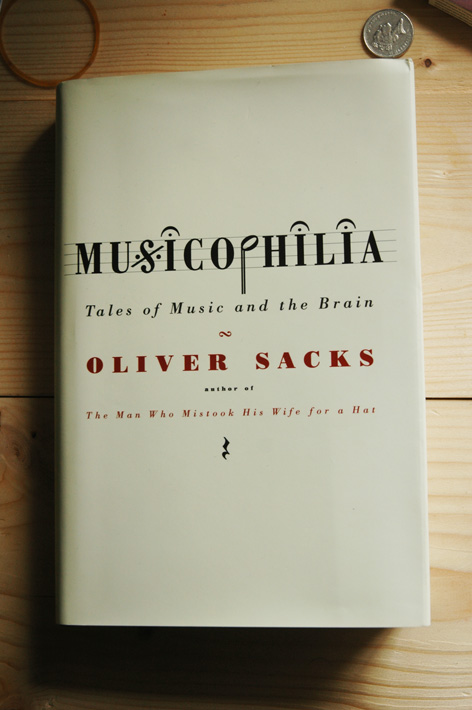
cover designed by Chip Kidd
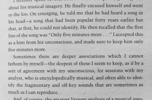
example of the "fi" glyphs

footnotes
What do you think?