Hi,
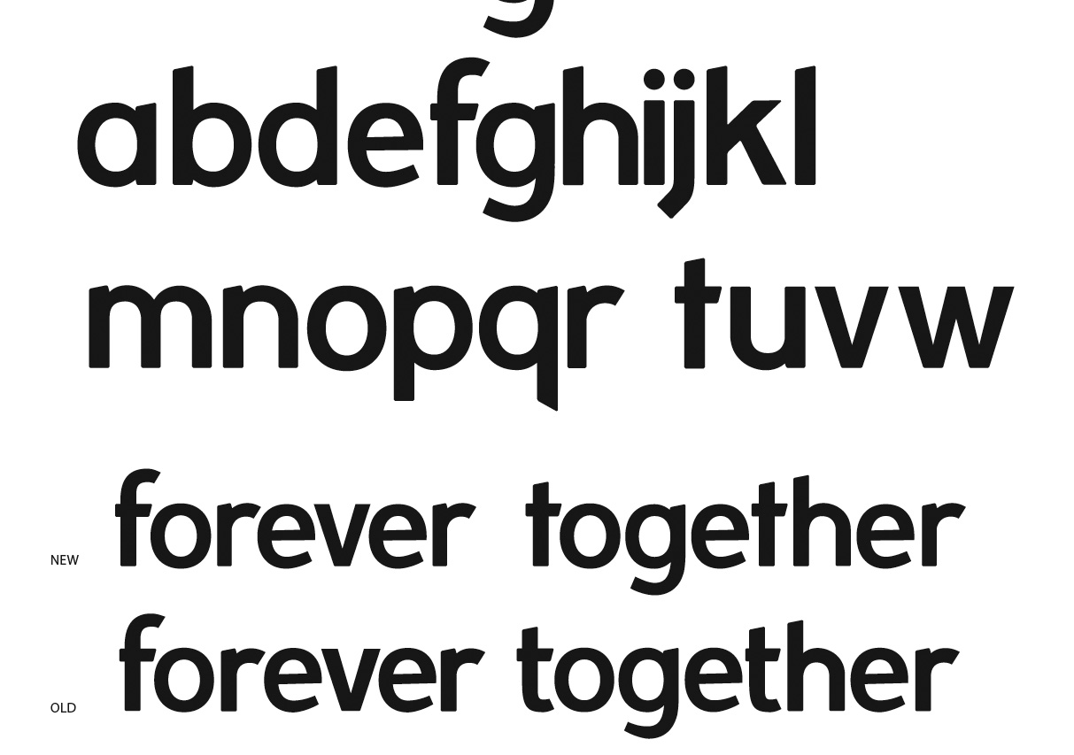
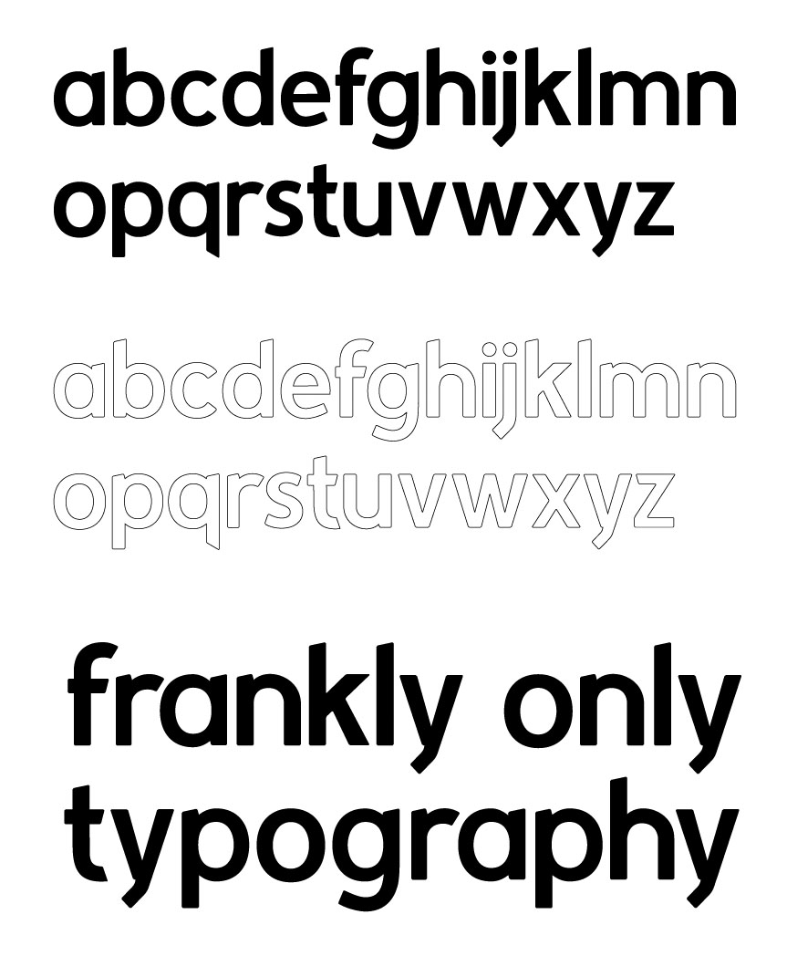
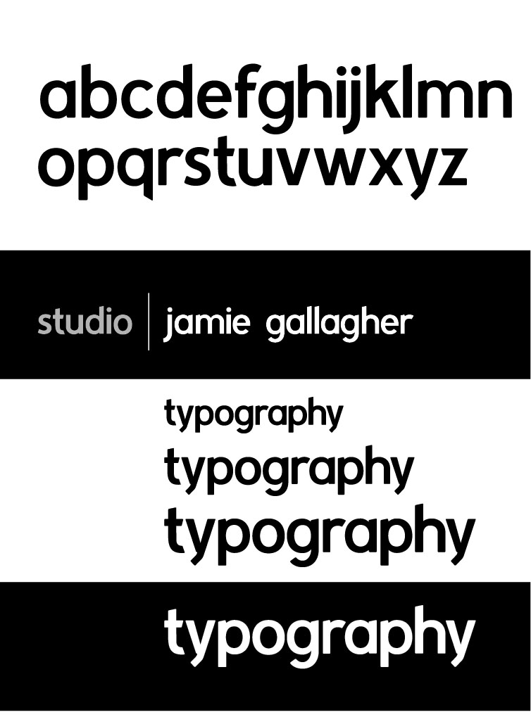
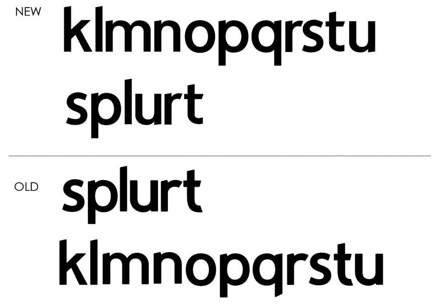
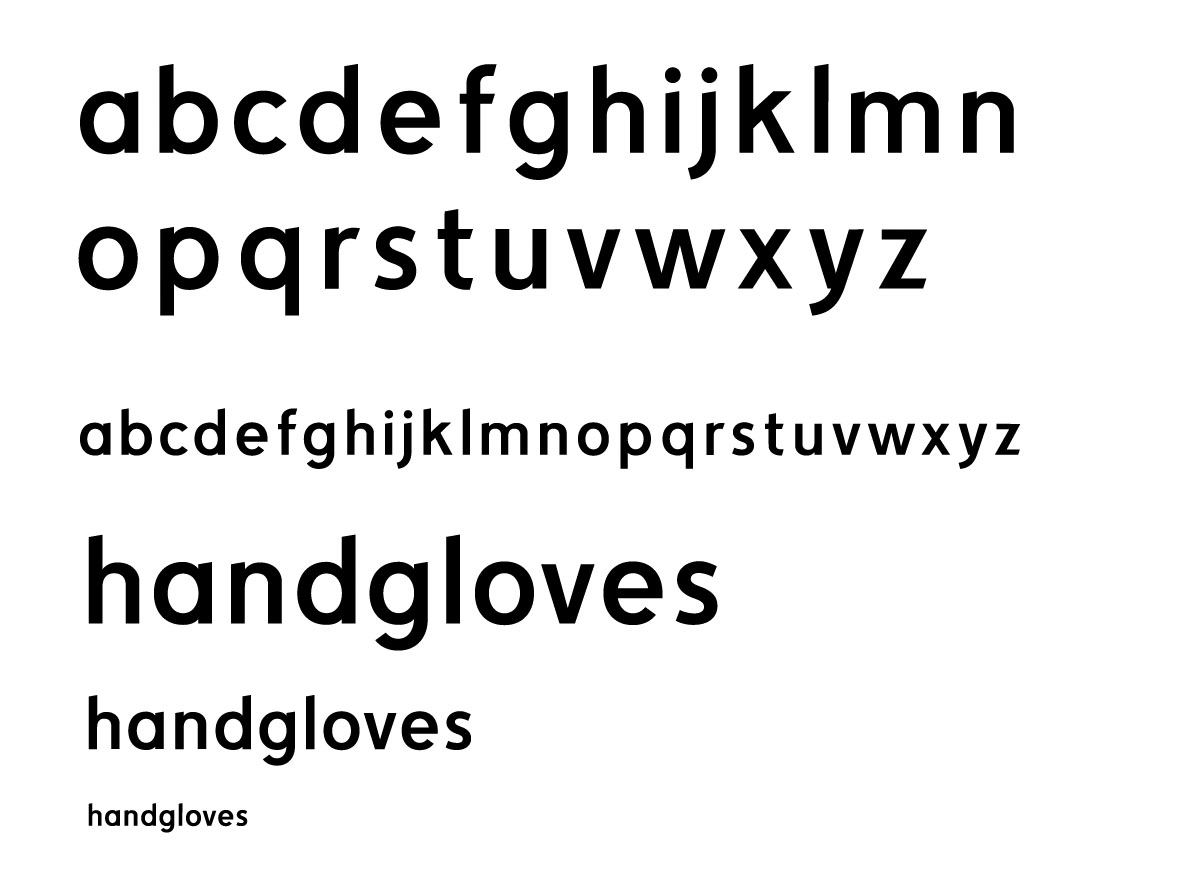
I started to work up a font ive been sketching in my moleskine for a while now..
I'm fairly happy so far (only a few hours in) but its early days... So I'm sticking it up for you guys to tear into.
I have thick skin - so don't hold back.
I would like to create a really solid, corporate, sans serif, and i guess this is the boldish weight.
any thoughts? like / don't like .. stuff i need to look at..
for me the 'h' 'm' and 'n' aren't working yet, and the 'e' is close but not quite.
I'd hugely appreciate any input.
Many thanks in advance.
Jamie
| Attachment | Size |
|---|---|
| gallagher.pdf | 59.65 KB |