
It’s THE book, according to the title.
THE book of mad roman emperors.
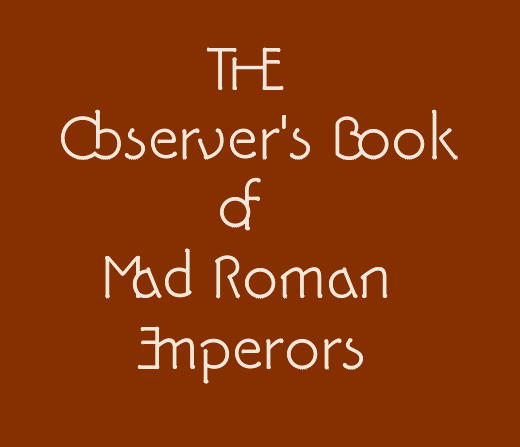
As you can see this is a barking mad font I’m working on. Bar-bark, woof.
j a m e s
It’s THE book, according to the title.
THE book of mad roman emperors.
As you can see this is a barking mad font I’m working on. Bar-bark, woof.
j a m e s

¡ hail !

Now that looks like fun!
ChrisL
Cheers guys. This font is plenty heap ’o fun. It’s a Roman inscriptional kind of thing, but not inscribed as such. A synthetic technical pen tool is the basis for the stroke design and finish.
It has Ar’deco-influenced Trajanesque capitals with several twists, quite a few phantom letters, a wacky lower case, and a contextual alternates feature that swaps in a more text-friendly (read: more readable) character set.
What else? Oh, a proper Lining Numbers feature: turn on the lining numeral set and all the math and currency symbols are positioned to suit. Luxury! What else? A supporting cast of 590 extras—-stacks of stylistic alternates and a staggering array of ligatures. Some of the ligature pairs are fitted like the THE word lig.
I’ve completed testing all the OT features, and now I’m finishing kerning.
j a m e s
Sounds like a winner! and different than the average bear.
ChrisL
It’s a bit of a scary bear, old Pykie needs lots of tender loving kerning. Creating kerning pairs in the font for all possible combinations—-even half of them—-creates a class-based proliferation reaching into tens of thousands pairs. Users will have to manually kern in some situations.
Pyke’s Peak requires its users to be lettering artists. You could say it’s a demanding font.
What the capitals get up to:

Mirror-pair ligs:


More craziness:

Digital letraset:
Captured from web.archive.org on 12 Oct 2008. view this capture