
Any comment on this first try at text font used in G magazine would be welcome. Thanks to Bleisetzer and wmayer for information on this.
Merci a l'avance
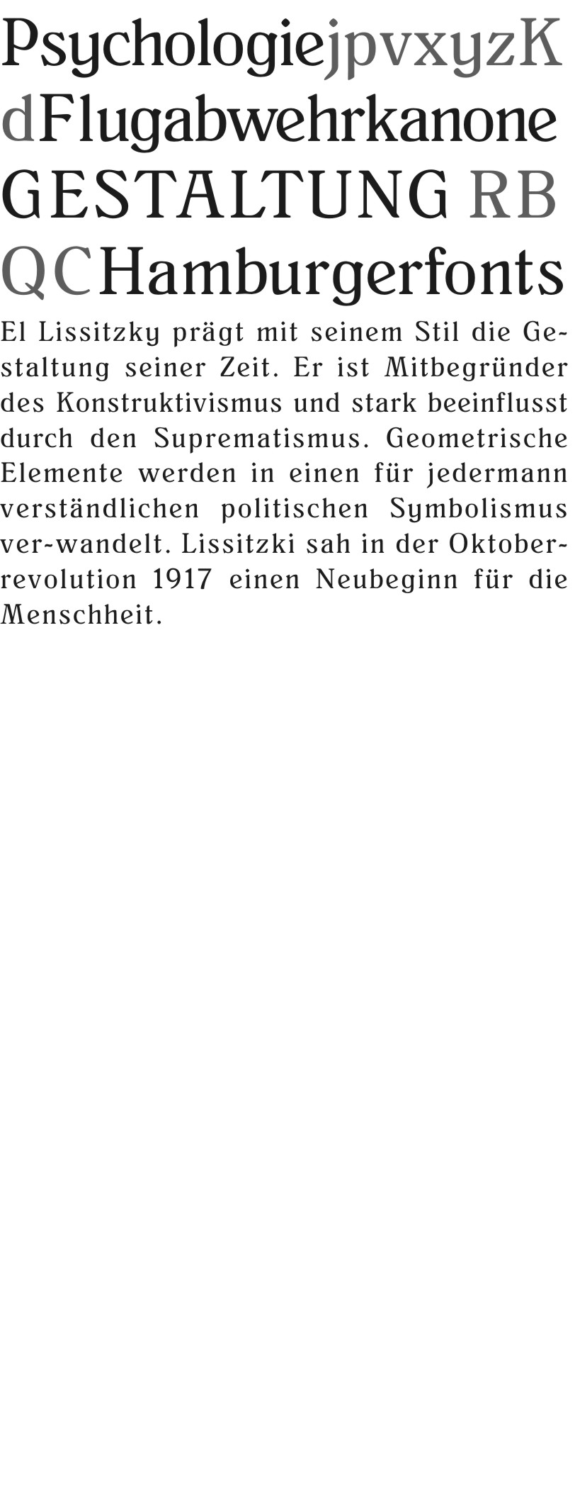
Any comment on this first try at text font used in G magazine would be welcome. Thanks to Bleisetzer and wmayer for information on this.
Merci a l'avance

Some of the stroke weights seem not right. Also the g and y do not go together. Bottom of u not good. This typeface reminds me a little bit of Benguiat. It is too strange to use for a lot of text, but is interesting for a small amount. But does not really look like display typeface either.
Captured from web.archive.org on 17 Apr 2015. view this capture