Typophile

HH Logo

squeeze

Aloha! I've been away for awhile, but I'm looking for some refining eyes today. Below is a representation of where I've arrived with my client after several alternative directions being pursued and rejected. I have identified (framed) the design that my client has selected from our elliptical choices. Aside from the obvious need to smooth some curves, please help me identify any other problem areas and offer up any color suggestions. The top two options are colors that I presented, while the bottom two are client requested variatinos. Thank you in advance for your assistance ...
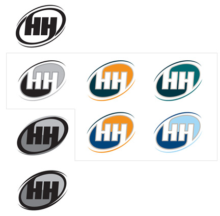
FYI: The business provides a service aimed at helping a husband by digitally delivering romantic ideas to strengthen their relationship with their wife. The mark must cross gender lines, but may be more heavily weighted toward the masculine side.

Mahalo,
Scott

This logo does not cross gender lines at all. It looks like a graphic on sportscenter or on a can of beer; it's very masculine. Additionally, I don't get a sense of romance in it at all. It kind of has a blade-like quality to it, which isn't very sexy or romantic. I would come up with some more ideas to pitch to the client.

---
Nick Hladek

I agree - even the baby blue one seems like a logo for men's razors or aftershave. Not inherently problematic, but seems inappropriate for a romance advice site! Perhaps something more modern and typographic? It should be strong... yet sensitive. ;)

(If this is in the final stages, perhaps just lose the outside strokes that seem pointy, and letting the colors make the ellipsis unstroked.)

---
eeblet.com

agree with comments above about the props put forward, I'm still shocked such a service is actually required.

----------
Paul Ducco
Graphic Design

"Additionally, I don’t get a sense of romance in it at all. It kind of has a blade-like quality to it, which isn’t very sexy or romantic."

I agree, but, then again, isn't that kind of the point? They're marketing it to men without a shred of romance in them. Perhaps this is right on the mark?

Thank you all for your comments. Unfortunately, I was hesitant to post much more info, due to NDA, but I have clearance from my client to be a little more forthcoming. Perhaps some of this info will pacify some of this critique (or maybe not).

The business is titled *[Business name removed by request] and has very much of an "average Joe with hero inside" approach. HH will provide monthly emails of pre-planned romantic ideas and reminders that enable husbands to easily sweep their wives off their feet ... and, yes, it's sad but true that "such a service is actually required" for some of us. Really, it's more of a helpful resource than a requirement.

Early in our process, we pushed the super hero direction pretty far, and later in the process we explored a series of these chest emblem type of designs. That is why this may look a bit sporty, and I may have understated the appeal to our masculine audience. At this point, we won't be heading in a different conceptual direction, but my client (though satisfied with the logo, as is) is open to some minor tweaking. Also, I presented several color choices that included reds (for romance), but so far, none have been accepted. Most of my original color options offered a male/female two-tone color combo. My client really likes blues and blue/gray combos. (I'm presenting to a very masculine Harvard grad ... but we've come a long way from this project's inception)

Thanks again for your comments ... I'd love to hear more.

Aloha,
Scott

"The business is titled *[Title removed by request]"

Given that, I find the logo quite appropriate.

I second Eeblet's suggestion to lose the outside strokes. I look forward to seeing the final choice.

Sharon

Thank you again for your comments. In response (and I hope I'm not frustrating you for not spewing out ALL of this info from the beginning ... I could've written an epic novel on this particular project), the mark has been presented both with and without the gray strokes and the disappearing outer ellipses. The client likes the gray stroke, feeling that it helps to separate the "H's" and he likes the disappearing outer ellipses which he feels represent an outer force-field or protective ring. Right or wrong, I have to appreciate a client who critiques art with valid reason vs. preferential opinion.

Keep the comments coming. So far, they validate some of the arguments I have presented to my client previously; and, if I am convinced it is necessary, I may revisit some of them with him ... with a stronger appeal the second time.

Thanks again!

I don't mind the gray strokes, but the warmth/coolness of them needs to be taken into consideration. As they are now, I like how they look with on the right-most, but the others they smudge and are muddy. The swashy lines are not defined enough at this point and I feel like they are almost an afterthought. Maybe unnecessary?

The top right is working the best for me only because the blue and green are they same tone so there is an evenness. But I think the gray outline needs to be darker on that one.

Nice to see you back, Scott.

Thank you, Tiffany. All good points that I'll try to address. I, too, prefer the top-right (colors), but it's a tough sell to this particular client.

I think the reason I prefer those colors is because of the overall effect. If you had warmer colors with a warmer grey (darker too) of equal tone it would work just as well.

As a Princeton alumnus, I'm tempted to take a swipe at Harvardians, but I won't.

Now, about your client who has no taste: when you mentioned *[Business name removed by request], I was disappointed to learn that the superhero direction did not pan out. Could we at least see it without the disappearing outer ellipse? It's that element that lends the Sportscenter infographic feel to it in my viewing. I think that it may have more of the superhero feel without the ellipse. Besides, don't we want to liberate the husband from the protective shield of idiocy?

---
Nick Hladek

Heh, I second all of Nick's sentiments. :)

---
eeblet.com

Regarding, "about your client who has no taste" and liberating husbands "from the protective shield of idiocy": my client has taste, just not good taste; and, his force field reference was related to protecting marriage. That's not idiocy, is it?

The superhero direction was not abandoned at all, just toned down. We are still trying to produce a mark that resembles a superhero chest emblem ... Think "Incredibles". (see below)

In addition to trying to smooth out a couple of curves, below is a response to Tiffany's comments. I've tried to add some weight to the outer "swashy lines" on the first. These lines remain thin on the second, as the grey relates to the stroke. The third shows the mark without the outer ellipse. I think the question of whether, or not, to include these outer lines will be answered as I experiment with the interaction of the mark with the title, "*[Business name removed by request]".

I invite more comments.

Have you thought about italicizing the HH *more? It seems very rigid inside the dynamic oval, I'm wondering if it would flow better with the oval if you gave the letters *more of an angle? I like the middle version, but I think the silver outlines could be thicker yet.

Regarding, “about your client who has no taste” and liberating husbands “from the protective shield of idiocy”: my client has taste, just not good taste; and, his force field reference was related to protecting marriage. That’s not idiocy, is it?

Sorry! Sarcasm and irony often read poorly in written form. You ought not take me so seriously, particularly on the "client who has no taste" part. Tongue was firmly inserted in cheek when I typed that.

On the count of the outside ellipse representing the protection of marriage, while the association may exist in the mind of your client, I doubt very much that the average viewer would wind up with that idea unless it were explained to him or her. I don't have anything against "protecting marriage," (as a married guy, it is not a completely alien concern to me), I just don't buy that those ellipses are so essential to the logo that if they were missing that concept would be lost completely.

As concerns these latest treatments:

  • The top one doesn't work as well as the bottom two.
  • The color of outside curves in the middle one lends more of a superhero feel to it. They're no longer as blade-like. I like it.
  • The middle one is a good compromise if your client won't budge on the outside ellipse element.
  • The bottom one loses the sense of motion that the top two have, although I think Chris's suggestion may address that. Still, I like the bottom one better than the top one.

--
Nick Hladek

Nick, don't worry, I wasn't offended ... just clarifying.

Thanks for the comments, guys. I'll continue playing (although, my client thought this design was done last week). Also, below are a few treatments with potential logotype. I'm struggling to find a direction I like. Any thoughts?

In previous presentations to my client, I had suggested some more wild type treatments, but it didn't fly with the Harvard guy. I also presented some alternative treatments of the HH (to make them more dynamic and less rigid), but they weren't accepted either.

I think the type waters down the mark.

Agreed. I don't think the type has to include all the colors of the mark.

if you're going for a 3d look ... it needs more.

as for the text ... I agree with the comments above ... it certainly doesn't add much if anything.

----------
Paul Ducco
Logo Design

I agree with you all. I think that's why I've had so much difficulty developing something I like. Thanks for the feedback.

I'll be presenting to the client again today, so I think I'll propose that we maintain a certain separation between the logotype and mark, instead of continuing to try and merge the two. Rosem, good suggestion ... I was fixated on using the brand colors on the type because I know the logotype will appear independent of the mark at times; however, instead of always using the spectrum, I can just do that when it is independent of the mark; and, even then, the application layouts may easily lend to accomplishing the branding vs. multi-colored logotype.

Thanks again for all of your comments. If there's anything else, I'd love to hear it.

Thanks for all of your help. During my last presentation, we finalized the following as HH's logo and logotype, which are independent of one another. Now on to the website and ad pieces, where I'll get to throw in a lot more color and imagery ... bringing in some elements of romance.

Aloha, Scott.

two little thoughts, these aren't critical, just thougts.

The multi-coloured one, although it's good, reminds me of pepsi logo, and the yin-yang symbol for the '.' in .com reminds me of the universal binary logo from apple:

Captured from web.archive.org on 4 Mar 2014. view this capture