Greetings all,
I'm working on a web site design for which I would like to use Corbel as the suggested font of first choice for text. This is a redesign of a site that now uses Verdana for text and Trebuchet Bold for display. Verdana works fine as basal text, but looks less handsome in bold, especially when set in all caps. Hence the current choice of Trebuchet Bold for display. The beauty of Corbel is that it seems to work well everywhere in the overall look and feel that we desire -- u/lc, a/c, bold, bold a/c, etc.
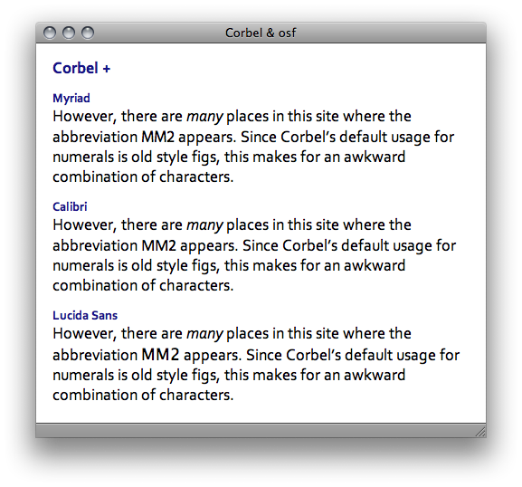
However, there are many places in this site where the abbreviation MM2 appears. Since Corbel's default usage for numerals is old style figs, this makes for an awkward combination of characters. (If Typophile is displaying my post on your machine the way it does on mine, you'll see this right here, since I am seeing an old-style 2.)
Numerals appear rarely on this site, apart from this one constant MM2 combination, so I am hesitant about using Corbel, lest site readers think it is an error.
The site is being built in CSS, about which I know just enough to be dangerous. And what might be possible in CSS3 certainly ain't possible right now . . .
If I understand this properly, I could ask that this be hard-coded to call for the particular desired glyph -- a "2" in modern figs -- so that this MM2 combination appears consistently throughout the site if the browser's system has Corbel. But any browser that does not have Corbel is going to display something unintended, and other than a modern-fig "2." Is this correct?
The client may be fine seeing the MM2 combo with the very short old-style fig 2, or it may be that they'll reject the idea out of hand. I'm just trying to understand what are the possibilities before I pitch the idea of Corbel.
Thanks for any input.
Bruce