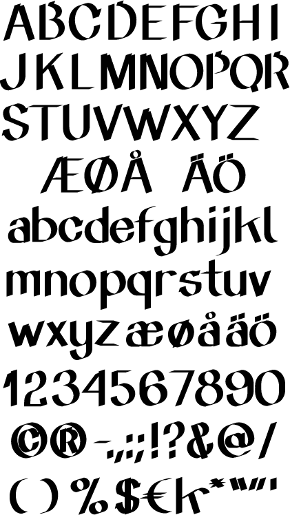
Hi there Typophiles!
This is a type I've been working on lately. It's a somewhat "mechanic" approach to a very analogue technique used mostly on sales posters in shop windows. Im looking for critique/suggestions on the basic design. I know there are many flaws and some bad spacing, but this is only the first draft. I'll post the whole alphabet in one or two weights later if wanted.
What do you think? Is there a place for a type like this?
All suggestions are welcome.
sample.pdf

Christian