Hello Typophiles,
I wanted to get a critique before continuing development of more weights and any obliques/italics.
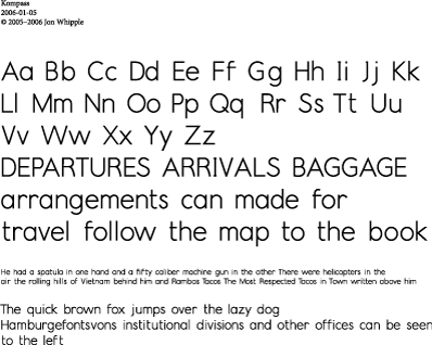
Kompass is intended for use in maps and diagrams. I also imagine its use in "invisible" applications like labels on material in libraries or inventories. The drawings exist as Illustrator files only at this time.
I would appreciate any advice and insight. Drawings and sketches are welcome if you are so inclined.
Here is a PDF for study, and a preview GIF (caution: inaccurate) to give you and idea of what it is:
 Kompass Sample Kompass SampleKompassPresentation.pdf (475.7 k) |