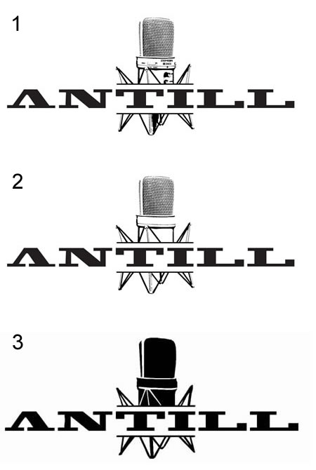
This logo is a relaunch attempt. It was voted favorite from five sketches I put up on our hobby music myspace page. Surprisedly, it’s the most straightforward idea I came up with, containing none of the nice little twists I now buried with the other sketches.
Taking it from here ... can anyone suggest a good font type for the name?
The biggest challenge is that it should match the music (here’s the myspace page). The current font is a modified Blackoak but it reminds me more of a retroish rock band with country elements. Something a little more modern which translates the individual character would be nice. In the music club beats are layered with processed samples of the instruments plus my lazy vocals ;)
Also, the type should look good in a complex, detailed variant (see 1) which we could use on a t-shirt, a reduced variant (see 2) for use on the website and finally a very reduced variant (see 3) for small flexprinting on a cap. Even in scenario 3 it should be legible.
What do you think? General logo suggestions are welcome, too, since I’m still working on the sketch. Once everything’s looking ok I’ll concentrate on color, kerning etc.