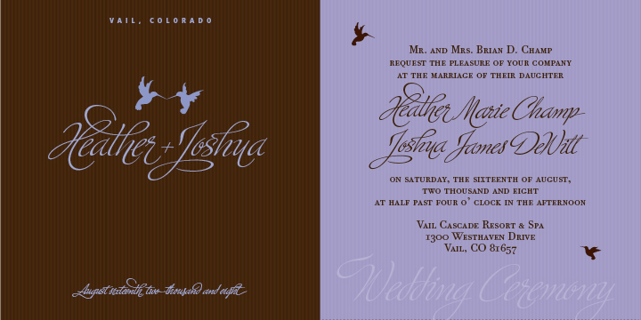
Here is the front cover (left) and an insert (right) for the first draft of my wedding invitation. Just looking for some feedback. It’s certainly a challenge finding the right pair to go with Ministry Script. Any feedback would be appreciated. The paper will be brown and we will most likely have the type foil stamped in a light blue (brown too dark for letterpress).
The wedding will not be overly formal and will be in Vail, Colorado. Outdoors.. think nature, aspen trees, pine trees, rocky mountains, mountain creek, etc.
I’m curious why some of the characters don’t seem to align/connect with each other with 0 tracking?
The verbage isn’t dialed in yet nor is the upper/lowercase, etc. Also looking at ampersand options for the cover. Again, just showing an initial draft for feedback.
Ministry Script, Bodoni Twelve EF, Frutiger Black Condensed
Thank you!