hi everyone!
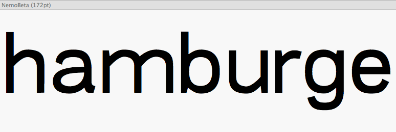
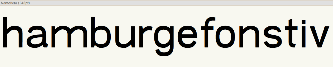
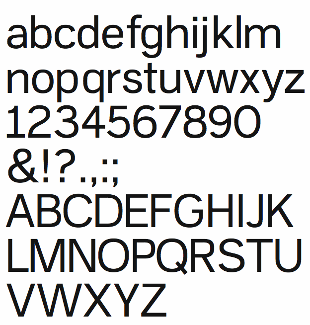
i am new here and here is my humble attempt, very fresh one. i would like to here from you, what you can recommend me to go on with. i have started with shapes in AI, but right now i am continuing working on it in FL. i am aware that there are still some inconsistence about certain shapes, but you can just go on with critique! :)
but please, keep in mind i am just a newbie!
my goal is, modern sans-serif which is influenced by akzidenz-grotesk kind of type.