Typophile

A CHEATER?

This thread ran to 3 pages of replies and only 2 were recovered, so replies are missing.

Christopher Miller

The proprietor of the site parachute.gr has in a different forum complained about TTF versions of his fonts being hacked and said to one member that he'd appreciate it if that member would buy his fonts instead of obtaining them in some unethical way.

However, perhaps someone can visit this page:

http://www.parachute.gr/fonts.aspx?Sample=1&FontStyleID=&FontFamilyID=53...

and tell me how the font "Muse" could not be so blatantly ripped off from Jos Buivenga's "Delicious." Which can clearly be seen in the lower case f, g, c, and s, and certainly seen in the remainder of the lower case letters. For that matter, with the exception of a few minor tweaks and added "serifs," the outlines are virtually identical.

Shameful.

virtually identical.

Are you alleging "point piracy", (i.e. file copying and modification), or just similarities of glyph shape?

That I believe I'll leave to the person comparing. Let's just say there are what one would call "similar" glyph shapes, and then there are identical glyph shapes with one being scaled horizontally perhaps 101 percent, or merely had a small serif slapped on it. As mentioned, download the pdf for Muse, find and download Delicious, and just do a cursory comparison. If it's within your moral structure, strip the Muse pdf, and open both fonts in any font creation program. It would be downright comical if it wasn't so nauseating. Somehow this doesn't strike me as being similar to copying helvetica and re-naming it helstetica.

Certainly, there are many similarities.

if you're going to make a serious accusation on a well-trafficked typography forum, you really should be a little bit more thorough, imo.

so maybe you could do a side-by-side, or onion-skinned comparison?

can you post the creation dates of the two fonts?

did you make any attempt to contact Parachute, or either designer and see what they had to say?

agreed, there are similarities, but if you are alleging point piracy, then show us what you have seen
and we can indeed make up our own minds.

Delicious
Muse

Curioustype: If it's within your moral structure, strip the Muse pdf, and open both fonts in any font creation program.

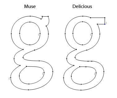
With moral structure intact and utterly unruffled by the journey near the Dark Side, here's a side-by-side comparison of the lowercase "g" from "Muse" and "Delicious" (no resizing involved, BTW).

The several instances of similarity are, to my eyes, disturbingly close.

Regards,
Ernie

Figures:

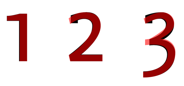
Sorry, but I just can’t let this one go unnoted, look at that "v" also.

In my opinion, they are way too close... something is not quite right here.

A follow up: Who did it first?

Mmm... This is the first time for me to see such a ripp-off thing. This is shameless contour hijacking. I started Delicious in 1994 and finished it in 1996. For what it's worth ... I can vouch for it that Delicious is completely my own thing.

To add some further proof, dating from the 31st March of 2004.

These kind of things really makes me sick.

Please let us know how you will proceed with this, Jos.

Jos, your current license seems to prohibit this type of thing, but has your license always been this restrictive? Looks like it may have been posted without restrictions in the past?

http://web.archive.org/web/*hh_/www.josbuivenga.demon.nl/delicious.html

In addition, there's no license text in the current download, not making any excuses but its easy for free fonts to end up in unintended places, and with no EULA it's a sitting duck.

I guess I have to take my loss on this one, Goran, and regard it as a wise lesson. As sii pointed out there's no license in the current download and it wasn't on the earliest Delicious page I clicked at the way back machine.

I wonder if an organization like the FDRC or ATypI couldn't reach out to starting-out freeware font designers more, by providing educational materials around font IP issues.

Of course some designers will be happy to put their stuff straight into the public domain with no strings attached, but having standard EULAs (from open source, like to OFL, through to more traditional EULAs) might help prevent heartbreak further down the line.

Something for us to talk about at next month's The Business of Type event (plug :-)).

Jos: there's no license in the current download and it wasn't on the earliest Delicious page I clicked at the way back machine

Nevertheless, there is a clear notation that shouldn't be ignored or taken lightly: "copyright" — which, unfortunately, appears to have been in this instance shamelessly disregarded.

As far as my knoweledge goes: the EULA can protect a font as a piece of software and copyright is just a way of mentioning that the (type) design is yours. Because copyrighting a font or type design is not treated the same in every country, what should (or could) I do?

It's one thing that they "borrowed" the design and "modified" it, but it's another to try and profit from it. Honestly, artist to artist, a collaborative effort should have been forged, and Jos should see part of whatever profit they make.

If Jos goes on a reclamation crusade, he could hurt the Parachute guys were it counts... in the pockets. Following them around the net and offering the original, all for a price that's hard to argue with. Could make some serious waves, and hurt some one's credibility.

But it's possible the Parachute boys just had a moment of ethical and moral lapse, and bringing it to their attention might be enough to set things right. Jos, you're a giving, talented artist and imitation is the best form of flattery, but you shouldn't be taken advantage of.

amen to that last one

>It’s one thing that they “borrowed” the design and “modified” it, but it’s another to try and profit from it.

Isn't that essentially how open source works? Many people out there believe that's how everything should work.

>Nevertheless, there is a clear notation that shouldn’t be ignored or taken lightly: “copyright”

True, the one font I looked at seemed to have a valid copyright string.

In the end I don't think it would hurt to contact the vendor.

A similarly close parallel investigation of other fonts offered by Parachute (a strikingly extensive catalogue) will probably answer many questions. There's no point contacting them, as they've been held accountable before and their position is known.

What is their position?

Is their position known? I'm afraid that I do not know it. I'd like to hear what they have to say.

I am not certain I understand how open source generates profit for anyone, but I claim ignorance because there could be an "Open Source" department store around the corner from me and I probably wouldn't know it.

As for the references to the other string regarding Parachute, I find this one much more provocative and specific. Furthermore, I believe there are a few posts from Parachute people in that string, which certainly now make for interesting reading. In fact I believe one comment was something to the effect of "Stealing? Us? Are you kidding?"

And for those who've followed this thread and still have yet to view both fonts up close, let me just reiterate here that this is not someone reflecting an obvious influence in three or four characters ... we're talking about virtually every character being identical, point for point. There aren't enough zeros in the Milky Way to quantify the odds of something like that taking place by accident.

Following them around the net and offering the original, all for a price that’s hard to argue with. Could make some serious waves, and hurt some one’s credibility.

Hurting the credibility of Parachute has already been done and I'm satisfied with that. It would have been just if they had asked me to use Delicous as a base for their muse face.

However it costs a lot of $$ and Delicious is still free and DeliciousX will beat every competition (I hope :-) for a smaller price.

Maybe I'll send them an e-mail, but actually I really want nothing to do with them. For the moment ... I just want to do my own type thing in the believe that I've got everything covered right now. I will however update my free downloads with a license.

And for those who’ve followed this thread and still have yet to view both fonts up close, let me just reiterate here that this is not someone reflecting an obvious influence in three or four characters ... we’re talking about virtually every character being identical, point for point. There aren’t enough zeros in the Milky Way to quantify the odds of something like that taking place by accident.

I second that, and I don't have to look at all the points' positions.

However it costs a lot of $$ and Delicious is still free and DeliciousX will beat every competition (I hope :-) for a smaller price.

Like I said, you can't argue with that. I'll be looking forward to DeliciousX!

Isn’t that essentially how open source works? Many people out there believe that’s how everything should work.

Well, usually the original creator gives their approval before someone starts whacking away.

"Isn’t that essentially how open source works"

Not directly. Open Source Software typically requires that if one uses the open source software for their own software, then their software must also be open source.

There are many licenses out there, of course, but most of them follow that concept.

Now, one can certainly still profit from the services that accompany the software (development, support, customizing, etc.)

> There’s no point contacting them, as they’ve been held accountable before and their position is known.

that's ridiculous.

The possibility exists that Parachute was duped by the 'creator' of the font, Vangelis Karageorgos. Logic suggests that the Parachute boys would not knowingly put up a font based on someone else's outlines, and logic also suggests that they'll take this font down as soon as they see evidence.

they might be guilty of not being aware of Delicious, but give them (the Parachute guys) a chance to defend themselves before calling them thieves, and setting out to hurt their business.

Karageorgos knows what he did, but I'd bet that the Parachute guys did not know that PF Muse was tainted.

Is their position known?

Their position (explained on a previious Typophile thread) is that this is a dodgy business and everybody plagiarizes.
So don't pick on the little guy if you're going to turn a blind eye and keep silent on, for instance, the Frutiger knock-offs, as long as they're done by a "reputable" company.
I would have to agree with them. Isn't this an industry that eulogizes the "designers" of "revivals"? Didn't we just celebrate 50 years of Max Miedinger's wonderfully derivative design?

Having said that, there are a lot of grey areas, and we have to draw the line in the sand somewhere, and "plagiarism is acceptable but point piracy and trademark (name) infringement is not" is what *we* as an industry have settled on, so all foundries should respect this, even though it's not perfect.

>what *we* as an industry have settled on, so all foundries should respect this,

Agreed, but in a way it matters less what the industry decides on (or for that matter what's legal) it matters more what the customers (typically graphic designers) consider kosher vs a "knock-off".

>and trademark (name) infringement is not

http://www.t26.com/fonts/Delicious

Fair enough Brian. OK. Let's find out what they have to say. I've send an e-mail regarding this thing and I will let you know the outcome.

@ Nick: Why shouldn't we try to stop the little guys before they become too big for us to make a difference?

That's unfair, and an abuse of power to protect the status quo. The end shouldn't justify the means.

Mr. Shinn I've agreed with you on more things than you'll ever know because I read quite a bit of what you write here and elsewhere. Unfortunately, this isn't one of those times.

I believe the one major difference between what you've opined and the real tragedy here is in fact a two-parter: a.) Delicious was and is a free font and among the best at that; and b.) I sadly must admit I've got underwear older than Delicious. Delicious hasn't even reached its peak notoriety yet, much less be anywhere near eligible to be "revived."

Additionally, the Parachute people are charging big bones, so to speak, for their version of someone else's font; not their version, interpretation, tribute, of the font, but a virtual exact copy. Certainly there are arguments for everything you wrote; however, perhaps another a$-chapper here is that most legitimate "revivals" are interpretations, created in part as a quasi-honor, and most certainly not a point-for-point ripoff by someone who didn't really try all that hard to disguise his actions.

Without question, typography is a lot like music or the motion-picture industry. In this case, however, someone has taken the exact bars and notes from a Zeppelin song, changed "day" to "afternoon" in the lyrics here and there, named the song "Foggy Hill Trot" and are selling it for big bucks ... all while brazenly sitting among true professional musicians and saying "really, we wrote that. It's nothing like ... what's that song you mentioned? Misty Mountain Hop? I've never even heard of that."

And finally, at least from a personal perspective, the Parachute people are especially shameless when considering at least one of them seemed to be offended by the suspicion of any "borrowing" going on, and another trumpeted the foundry's value while cramming in between it all what amounted to, "everyone else is doing it, so why can't we?" Let's pray none of us in-denial plagiarists decide to jump off a bridge.

The bright side here is the Parachute version of this font seems aptly named with "Muse." I'd say Delicious provided the perfect "Muse."

In support of your point, however, certainly Southern Software and its ilk do this kind of thing on a massive scale. However, even in that case, SSI offered cheaper versions of more expensive fonts; here, someone's taken a very good free font, copied it, renamed it, and now is selling the Muse family for more than a downpayment on a JetSki.

Frutiger vs. Myriad is a fight, even if a one-sided fight. This was unmitigated larceny by people who - despite having their faces on hi-def video surveillance and carrying a sign saying "PARACHUTE" - still come here and have the nerve to claim, "that's not us." I'd swear one of them has to be Martin Short.

Nick, I'm not rioting typophile ... I'm just talking about the grey areas mentioned by you. This case is not really about revivaling a celebrated typeface.

"Karageorgos knows what he did, but I’d bet that the Parachute guys did not know that PF Muse was tainted."

Just a question - how could two self-proclaimed legitimate typographers go through the entire process of releasing the font, etc., and selling it for goodness knows how long without knowing about "Delicious" while at the same time a meaningless piss-ant like me recognized it the very first time I saw the font "Muse?" Delicious hasn't exactly been second behind where Jimmy Hoffa is buried as the planet's biggest mystery.

And in furtherance of that, I can't remember Jos ever really plugging or pushing Delicious (if anything, he was justifiably protective of it), yet it still when you search Google for the string Delicious "Jos" free font, you get 67,000 results ... and that with the term "Jos" in quotes.

Should someone lean more toward the basics of morality, however, one thought continues to come to mind: ignorance is no excuse.

Pay no attention to the man behind the curtain correcting a double post.

CrossPost ... WoW ... I'm flabbergasted with Christopher's replies. Guess I couldn't have said it better (only shorter :-)

most legitimate “revivals” are interpretations, created in part as a quasi-honor, and most certainly not a point-for-point ripoff by someone who didn’t really try all that hard to disguise his actions.

What's the difference--fessing up? That is indeed the distinction that separates plagiarism from homage.

IMO, the "expiry date" is the key ethical concept with regards to copyright and plagiarism.
Content creators deserve a limited-time monopoly to benefit from their work (during their lives), but after that it enters the public domain.

>It’s one thing that they “borrowed” the design and “modified” it, but it’s another to try and profit from it.

Isn’t that essentially how open source works? Many people out there believe that’s how everything should work.

That stinks, implying that those of us who find good cause for some open source fonts also think copying someone else work without credit, and reselling it, is OK.

Below a portion of SIL's Open Font License, also followed, I believe by the Greek Font Society.

The OFL allows the licensed fonts to be used, studied, modified and redistributed freely as long as they are not sold by themselves. The fonts, including any derivative works, can be bundled, embedded, redistributed and/or sold with any software provided that any reserved names are not used by derivative works. The fonts and derivatives, however, cannot be released under any other type of license. The requirement for fonts to remain under this license does not apply to any document created using the fonts or their derivatives

Pretty clear about prohibiting reselling or relicensing the font, modified or not.

If font developers in the commercial sector wish to so restrict their fonts that they are of little to no use for some applications that is their business; the marketplace will sort it out. But to insinuate that those of us who support OFL also support what amounts to piracy, strictly legal or not, does a disservice.

Without fonts like Charis, Gentium, and the offerings from GFS, a number of authors would not be able to prepare manuscripts so that typesetters could use the author's files economically; without permitting limited font modifications as allowed by Adobe's EULA, some scholarly books could not be published.

Believing in that is a far cry from supporting the shenanigans apparently going on as reported here.

>how could two self-proclaimed legitimate typographers

"Never attribute to maliciousness that which can adequately be explained by stupidity!" Mark Twain

Oh and Typophile edit rides again! Yehaw!

>Believing in that is a far cry from supporting the shenanigans apparently going on as reported here.

Do a search on the type designers name + "font" and see what links comes up. ;-)

This case is not really about revivaling a celebrated typeface.

Right Jos, I was just talking about the general skew in type culture. Of course, everybody mines history these days, but no-one does it better than type people!

But I'm repeating myself, I actually think there is a hell of a lot more original work being done now than five years ago -- just look at Typographica's Types of 2007.

>IMO, the “expiry date” is the key ethical concept with regards to copyright and plagiarism.

Also I think the expiry date varies according to the TM status of the name. Fonts that should perhaps have reached that date remain untouchable as their marks are actively policed.

"What’s the difference—fessing up? That is indeed the distinction that separated plagiarism from homage."

Not only fessing up, but I'd like to believe in some cases that yes, homage. Perhaps my idealism is misguided ... I prefer to identify what you call "fessing up" as - at the absolute least - "acknowledgement." And again, perhaps my ignorance is once again dancing on my forehead, but these "revivals" often are of typefaces not originally drawn on a computer and thus, unable to be duplicated hammer-stroke by hammer-stroke OR point by point.

Visually they may be identical, but it still required some typographer to replace pounding iron with drawing his or her own points. Between that and yes, the confession/acknowledgement, I simply cannot see how the two directions could be compared. Believe me, I fully agree - originality is rare in typography, music, any form of art. But this wasn't a cover song, a conversion from metal or plate to digital, or even a parody like Mad Magazine. This was Brett Buster and Violet O'Mara starring in the four-hour southern epic Swept by the Storm and getting offended by comparisons to Gone With the Wind. They're playing a shell game here, except they're trying to use three balls and one shell.

If anything, just the flagrant nature of would seem to offend everyone, not just Jos, because it seems you're defending what in essence is Parachute's belief that we're all idiots. That's probably the difference between us - though not my font, I take this kinda personally; it seems you take a more pragmatic, liberal approach. Which is why I'll be dead at 50 and you'll probably live to something divisible by 50. Still, I can't shake the things said in the other thread by these people.

"Content creators deserve a limited-time monopoly to benefit from their work (during their lives)"

Agreed. I think Jos just posted something, however, so unless he died of carpal tunnel in the last half-hour, his limited time is still ticking.

Now please, Mr. Shinn, would you just die already? Not actually die die, just for like an hour or so. OH my - never mind ... I lost my head there for a second pondering the idea of your work being part of public domain. My apologies sir.

Right Jos, I was just talking about the general skew in type culture. Of course, everybody mines history these days, but no-one does it better than type people!

I've never encountered it this way, but it seems like you want to thrive this discussion to some general thing that I —in this current thing that's going on— find hard to comprehend.

because it seems you’re defending what in essence is Parachute’s belief that we’re all idiots.

Chris (please call me Nick), it was more along the lines of "as ye sow, so shall ye reap".
Parachute may have crossed the dividing line into point piracy, but I suspect they don't think that's any worse than a legitimately-drawn Frutiger clone which didn't even bother tacking on a few serifs.

it seems like you want to thrive this discussion to some general thing

Isn't that how Parachute considers it? They have said on Typophile (Ralf's link, above), "We do not claim some high degree of originality here, but *only to the same level as other companies do*."

just because everyone else is doing it doesn't make it right. i learned that one in sunday school...

*edit* @ Nick:

What's your point? Let's get real. It's the "How the differ" thing in the same paragraph that bothers me.

Sorry, Vangelis, but explanations proffered so far are unpalatable and tough as old boots. I have no stake in this squabble, save this: honesty. That being said, it may be time to don your fire-retardant underwear...

Vank: "Contrary to what my impression was, the font [Delicious] was just freeware and not open-source. Hence I should have never used Delicious and the previously mentioned fonts [Meta, Syntax, and admitted but unspecified others] as a base in order to create a different font with additional value, more weights, variety and so on."

Notice of copyright wasn't ample clue that you ought not tinker with someone's work, let alone lift it indiscriminately as the core for what you presented to the world as "original" work? Additionally, Meta and Syntax are neither freeware nor open-source, but such rude facts generated zero compunction?

Vank: "I should be contacting very soon the designer of Delicious and resolve this matter in the best possible way."

Better late than never, eh? Will you similarly make amends forthwith about fiddling with the innards of Syntax and Meta? Confession may be good for the soul and all that, but restitution might speak volumes — certainly more so than feigned contrition.

Vank: "I have asked Parachute to withdraw the font until a satisfactory solution is reached."

Permanent withdrawal would probably be better still, inasmuch as this concocted product seems far too tainted.

Vank: "I APPRECIATE the effort of people producing software to be distributed freely and BY NO MEANS would I ever intentionally cause any harm on such efforts."

Funny stuff, that, if it didn't ring so false. In the case of Delicious, can anyone seriously believe you simply overlooked a clear copyright notice? Moreover, this "software ... distributed freely" bit doesn't touch on your admitted use of Meta and Syntax (and others) — i.e., "pay-ware" is somehow "fair game" by your lights? Is the process to toss 'em in a blender and spin well until an "original" congeals?

Vank: "I find completely unjustified the effort to harm Parachute's credibility"

That's too much like the pot calling the kettle black. Marketing a sham "original" did the company no great service. Judging by the comments of Angelos Bakas (a.k.a. "acrobat"), above, Parachute's supposed "credibility" is already dubious at best. I see no concerted anti-Parachute "effort" afoot here ... though maybe there ought to be one. D'ya think?

Vank: "... if I had been contacted directly, this matter would have been resolved in the best possible and civilized way."

Whoa! Wait a minute now. It's somehow become the responsibility of the guy you decide to rip off to contact you and say, "Please cease and desist," instead of it being your obligation to not pinch his goods in the first place? That doesn't track well at all.

Vank: "... a lesson for us young designers ..."

Yeah, right. That's akin to saying, "C'mon, folks. Let's just chalk it up to a youthful indiscretion, shall we?" No excuse, sir. Not on a bet.

Vank: "This has been indeed a valuable lesson."

Yes, indeed. Phrased bluntly: "Thou shalt not steal."

I, for one, certainly hope you move with all due speed to rectify this matter. Jos seems a first-rate individual, so perhaps he can forgive. It's been quite tawdry, all in all, and I fear the mar will remain. More's the pity.

*typo edit* solfeggio, although you make some valid points wouldn't it be better to see how this plays out rather than kick the man while he's down?

" I am wondering how you would react if the font in question was yours? Because you’re curious?"

Nope. Just the curious type.

Actually Nick Mr., I was humbled by your outward response in this thread (to a certain degree, anyway, though I felt it was a bit lenient) and wondered if the right-brainer in you would have a more emotional opinion. In strictly analogical terms, to me this is almost like how one would feel watching someone else's wife getting slapped vs. watching your own. The former vision could be rationalized by saying "a lot of people beat on women - yes it's tragic. But you can't just single out one loser when handing around criticism." In a typographic sense I am wondering if you'd apply the same theory. Or would you, like me, look for the guy and limit the remainder of his life's menu to jello through a tube?

Along these same lines, I have been just as humbled by Jos' response to all this. Although I also was warmed by the fact that yesterday he was on the verge of calling the Parachute guys silly nincompoops.

As for "Vank," first let me say I admire very much the guts it took to step up like he did - even if he what he said left much to be desired. It must have been extremely difficult to read the content of this thread. Still, after a night of sleep and newfound commitment to the idea of live and let live, I can't help but question the intent. This wasn't a journeyman designer driven by influence who submitted a font that was lackadaisacalamandabody released for sale at almost $400 for the family. Obviously Vank knew of Delicious's existence, and there are - or should be - more than just a few tees to cross and eyes to dot before a studio puts a font on the shelf for purchase. Clearly, decisions had to be made, perhaps a few last-minute alterations, etc. I cannot help but believe that SOMEWHERE along the way during this process, more people than just Vank had to have some clue what's going on.

I compare it to baseball, football, or perhaps even that strange game where the men run all around the field trying to kick(!?) the ball into a net bigger than my apartment. The best leaders of organizations in these arenas not only know their players, they know everyone else's, and who is on their way to the big time. Granted, they may not know EVERY standout in their, or should I say on their field, but in comparative terms, they almost should at least be aware not only of "Delicious," but of Jos himself. I think Jos is blue-chip all the way, and I'd find it difficult to believe most on this site haven't either become aware of him, or at least his work.

I have been trying to bite my tongue until both sides had aired ther views on this including Parrachute. While it is fair to say that the derivitive work may not have had a proper EULA or perhaps freeware vs opensource issues caused some confusion and muddled the legal issues, the ethical issues are another matter. Even if there were absolutely no way for a person to sued for the "youthful indescretion", how could they live with themselves as a human being? It should not be an issue of, will I get caught--it should be an issue of ethical human behavior. If you claim to do original work, then see that it is original. If you derive a work from someone else's sweat and toil, be a man and give them credit at the very least. Type designers are a small brother/sisterhood of people who work countless hours. Most give freely of their experience to others in guidence and cheer eachothers success and releases as if they were family. Vangelis, you are Jos brother in this craft, honor him and his work like a brother--don't become a thief in the night and betray his trust.
Vangelis was my fathers name and you have dishonored your own family. I am sure your parents raised you better than this deed betrays.

ChrisL

"wouldn't it be better to see how this plays out?"

Simon, upon further reflection, in view of the shenanigans under discussion, I think my comments are fairly restrained and warranted. So, no, I frankly don't see this as kicking anyone while they're down. Similarly, I don't find "the open source explanation" plausible. If you feel otherwise, well, that's your privilege. We may merely need to agree to disagree this time around.

Best regards,
Ernie

...it should be an issue of ethical human behavior...

Sage advice, Chris. Courtesy and Respect.

>We may merely need to agree to disagree this time around.

Fair enough. Thanks, Si

Hi all!
My name is Charis Tsevis and I am a designer who collaborates with Parachute Fonts too.
I ve been informed about this thread and I am writing what I think and feel.

1. Vagelis aka vank was obviously wrong.
What I understood is that he wanted to create a sans serif font (like Meta or Syntax) and he is based on Delicious, which was freeware.
He thought it was open source because he had one of the first versions, those without a EULA.
He made his new font wich was a 600 characters typeface with 10 versions.
OK. He was wrong. He had to give credits and communicate with Jos in the first place.

BUT...
2. He directly accepted his fault and he is willing to correct it.
As anyone here is not knowing him personally, it's better not to guess what happened and what he is going to do.
You better wait and see.

2. Some of you, fellas, are going too far away.
It's really sad to read about ...beaten women, cheated wives, companies with questionable credibility.
And all these without knowing facts, persons, companies etc.
OK, this is the internet, where everyone of us is usually expressing him self very fast. But, wait a minute. Ask yourself if you really know what you re saying.

After quite an hour of reading this thread (Sorry for my bad english) I am really feeling sad.
Vangelis is being treated like a thief and you ask to boycot Parachute Fonts, which is a group of 13 designers.

I only hope this wont open another battle.
Thanks for listening.
Best

Charis

"I have been just as humbled by Jos’ response to all this. "
I think that's a good sentiment. It's pleasing that this situation has at least begun to resolve itself.

I believe it was I who used the phrase "boycott" in passing. I wasn't serious, I had posted in the wrong forum (had the wrong window open), and played it off as a poor excuse for a witty response, as well as in poor taste, and have since edited that post (before Charis mentioned it). Charis, I apologize for any personal affront, as nobody should be held accountable for someone else's transgressions.

After discussion, I withdraw my opinions, stated or unstated, as this seems to be a matter between two designers, neither of which are me. I however, offer my support of any typographer or designer who has not been given credit for their work.

(adding insult to injury, i'm correcting this post as i spelled Charis as Chris... selective dyslexia i think)

"He thought it was open source because he had one of the first versions, those without a EULA."

Open source does not mean 'do what you want and resell it'.

>Open source does not mean ’do what you want and resell it’.

It seems to, at least in this case...

http://dejavu.sourceforge.net/wiki/index.php/License

... where the base fonts even contained a (c) Bitstream notice. The red flag should have been that legitimate open source software would come with at least some form of license? I assume by definition public domain software doesn't/shouldn't have a license?

I assume by definition public domain software doesn’t/shouldn’t have a license?

Is that irony?

+++

In addition to aluminium: freeware also doesn't mean that you can take the font and make it your own. There was a copyright notice in the font file clearly stating my name. Just a simple google on "jos buivenga" would have brought Vangelis more than enough results to trace me. In fact he only had to click the first search result for a possibility to contact me. I think that if one makes a font using another font as base, one should at least have the courtesy to contact the original designer. btw ... If he had, I would never have giving permission, but that's another story.

As Chris comment wisely stated: we are all brothers in this craft. My "humble response" can only be credited to all the efforts my fellow typophiles put into their elaborate, wise (and sometimes a little bit too fierce) comments. I'm not angry at all, regarding everything I can only hope for a proper solution, but neither Vangelis nor Parachute have contacted me at this moment.

Hold on just a minute there, Charis. I think you just burned my butter.

"And all these without knowing facts, persons, companies etc."

Let me be extremely clear about this, so there are no misunderstandings. In this situation, I know the only two facts anyone needs to know.

First, Muse is not "influenced" by Delicious, it IS Delicious. I don't believe I'm alone here in identifying Muse as a virtual point-for-point recreation. There is a tremendous difference between "influenced" and "copied," be it professional, ethical or otherwise. Please do not continue to insult my intelligence by claiming anything else. George Thorogood was "influenced" by Jimi Hendrix - he didn't pillage through all of Hendrix's unreleased material and release an expensive album with songs he claimed were only "influenced" by Hendrix. I find it nothing short of disgusting you would even make such a suggestion.

And second, the real shame here is I had to be the one to tell Jos (indirectly) about this theft, when HE should've been proudly telling all of US about the new release on which he collaborated with the Parachute studio. Charis, say what you like. I will never believe that among the designer, the studio and whoever else came and went in between, the designer and an insignificant weenie like me in Lakeland, Florida were the only ones who had any clue about the story behind this font.

Beyond those facts, nothing else really matters. We're not talking about events taking place in a compact, three-day stretch, that involved an honest mistake and how you interpret the meaning of "influence." There is very little black and white here. Black and white exists when a few numbers and key lower-case letters like a or g share some striking visual similarities. Not when virtually every single letter is an exact duplicate.

People seem to like quotes here, so let me throw mine in the ring, which I believe has some applicability:

"Almost all our faults are more pardonable than the methods we employ to hide them" - Francois de La Rochefoucauld

"It seems to, at least in this case..."

No, the license says that...not the fact that they happen to be open source. I'm not even sure they are open source. No where in that license does it state as such.

So, if one can't find a license one shouldn't a) assume it is open source by default and b) even if they do that, assume the specific license grants them the right to sell copies of it.

I'll drink to that!

I thought it would be ethically correct to withdraw the font due to the visual similarities of the two fonts, and not for any other reason since point-by-point the fonts are simply not the same.

I spoke on influences on Syntax and Meta, not source files; blame me, if i did not clear out enough.

I like freeware software, i appreciate Open source software, and i respect people who participate in such offerings to the masses. This has been the very reason I myself have participated in open source font-project in the near past. Furthermore, once again, accept it or not, it is a fact that this freeware font was misconceived as an open-source font.

I have already contacted Jos. I am also sorry i involved Parachute in this matter. I hope this ends here.

Perhaps one thing to take away from this situation is to "ask first". Whether a EULA comes attached to a font or not I think assuming any sort of rights of protection or use, especially in cases of commerce, is never good or safe.

I think we, Typophile, are above how low some of the blows were in this thread. It isn't a question of what is right or deserved. It is good to see we stand up for each other, that in and of itself isn't a bad thing. Vank has come forward, hopefully Parachute will respond to Jos (here or otherwise, it isn't up to us).

"since point-by-point the fonts are simply not the same"

And my aunt's an uncle.

Nudging one or two points every other character just to be able to claim a difference in the font is almost more offensive than simply leaving the entire font intact. So in the places where the fonts ARE different - other than the upper-case "R" and other such obvious alterations - are you saying that Jos' Delicious was "just off by an em unit or two" here and there? You must since you've identified the font as an "influence" and thus, obviously would rather improve on - than diminish - the appeal of the font. Jos, I guess you need to tighten up a little there, buddy.

Also, help me understand something here, Vank. You wrote:

"... I myself have participated in open source font-project in the near past [yet] this freeware font was misconceived as an open-source font."

Open source, if I'm not mistaken, is a collaborative effort that, for lack of a better description, involves tons of creators and designers who all still pretty much know the two or three places everyone congregates online to exchange and interact. Also to the best of my knowledge, a large percentage of open source material can be freely downloaded or perused on two or three main sites (not counting ftp sites from which one can download the downloads).

I am making no accusations here. However, as you yourself participated in the open source font project, I would think you far better than most would be among those less-likely to be prone to such "misconceptions."

Vank, part of the point here too is cut and dry as the rest: there is little room for "misconception" under these circumstances. If indeed that was a consideration of yours, you don't hope, assume, or even rely on your certainty. You find out. Then you double find out. And you do what you have to do until the possibility of misconception no longer exists. These are not strict guidlines, or my rules, etc. For one thing, it's known in its most primitive form as "respect." However, this approach exists in many forms on many levels beyond mere respect.

Vank, whether you realize it or not you essentially decided early on it would be better to seek forgiveness than permission. Yes, you are correct - they aren't EXACTLY the same fonts, and Delicious is a free font notwithstanding the copyright spider web. Perhaps now you could explain how either of those facts mitigates any of the damage resulting from this, if any? Are you really going to stand behind a claim such as "I've tried to be apologetic and express remorse, but you know, it WAS a free font so tough sh**?"

I admire your guts to appear here, believe me - however, you still seem a bit recalcitrant. I would imagine you hope it ends here. Unfortunately I think your voting privileges might have been placed on hold.

Chris, you can call off the dogs. I believe Vagelis is making an attempt to rectify things between him and Jos. He didn't need to add anything to this discussion, but he did. As for the details outside of this discussion, we'll just have to wait and see what happens. He made a mistake and has admitted it, no need to run him up the pole any further.

This has been an eye-opening discussion, and hopefully it's message will carry on.

"Chris, you can call off the dogs."

you're right. thanks for the slap in the face ... i was starting to get tunnel vision,

"it is a fact that this freeware font was misconceived as an open-source font."

I'm not sure the connection there. What does misconceiving it as open source have to do with reselling a derivative of it?

"I’m not sure the connection there. What does misconceiving it as open source have to do with reselling a derivative of it?"

Not certain, but I do know open source material is in effect like one big giant universal collaboration on various programs, fonts, etc., and exists in a world where the concept of copyrights causes nasty, painful skin and brain irritations to those involved. As for making profit from material derived from an open source project ... I can't really quantify the morality of that without more thorough knowledge of all the factors involved. I imagine if you can take a program born under the open source idea, make dramatic improvements to it and sell a finished project that hardly resembles the original software, you'd make it as far as engaging in questionable conduct. In my eyes only mind you. Now we really are talking about some grey area.

The kicker here was that not only did Muse's designer not make absolutely certain the font originated as open source, he didn't even bother to contact the original designer - whose identity must have been known to him - to find out.

That has been one of my points all along - this is nightmarish on all kinds of levels and not just a debate on an isolated oversight.

Wait ... doggone it. Sorry about that Andrew. Just when I think I'm out, they pull me back in.

>can someone please take Bank Gothic and make a revival that FIXES all the hideous mistakes Morris made back at the turn of the 20th century?

Or here you go:

http://www.dilworthtypographics.com/portfolio.php?spec=bridge%20gothic

Or here you go:

http://www.dilworthtypographics.com/portfolio.php?spec=bridge%20gothic

The R is still hideous, but it's a much better version than the original!

+++NEWS+++BREAK+++

Vangelis and I have settled this matter for once and for all in a fair way.
I'm sorry I can't give you more details about it.

I've learned a wise lesson form this and as far as I'm concerned Muse can be put back online ... but that's up to Vangelis now.

I do want to thank Curious Christopher for spotting this, all typophiles for their generous support and I like to conclude this with the words Tiffany posted:
"I think we, Typophile, are above how low some of the blows were in this thread. It isn’t a question of what is right or deserved. It is good to see we stand up for each other, that in and of itself isn’t a bad thing."

"I do know open source material is in effect like one big giant universal collaboration on various programs, fonts, etc., and exists in a world where the concept of copyrights causes nasty, painful skin and brain irritations to those involved."

Open Source simply means the Source Code is openly available. You can look at it. You can change it for your own use. Ideally, the license allows you to contribute back.

That's it. That's the basic definition.

Beyond that, like ANY IP, the specific license can change/add/subtract all sorts of rights/restrictions/benefits and the like.

I think too many folks in this thread are confusing 'open source' with 'public domain'.

"The kicker here was that not only did Muse’s designer not make absolutely certain the font originated as open source"

IMHO, the kicker is that he assumed it was open source...when the open source definition make NO STATEMENT WHAT SO EVER that one can freely modify and resell it. ;o)

Amen

Well congratulations to Jos, props to Vangelis and good night to John Boy. It is unfortunate that an issue much in need of debate/discussion had to involve actual people and events. As for low blows or being above some of the things appearing in this thread, sometimes making an omelete requires cracking a few skulls. And if Jos consents to the font being sold as is on the Parachute site, I wouldn't object one bit to seeing this entire thread removed permanently. The discipline was my first concern; Jos being intruded upon was my second, and the personal offense I took coming in third. In the end, lessons were learned, foundations were reassessed and Jos seems happy. My own personal offense and what the studio knew and when it knew it are not in need of reconciliation.

Wait .... cracking a few EGGS. My bad.

Thanks Jos, for the Fonts!

>can someone please take Bank Gothic and make a revival that FIXES all the hideous mistakes Morris made back at the turn of the 20th century?

Another new one here:

http://www.myfonts.com/fonts/alphabetsoup/bank-gothic-as/regular/

As for low blows or being above some of the things appearing in this thread, sometimes making an omelete requires cracking a few skulls

I guess you're right. Thanks to all the cracking this thread probably did resolve this thing. I didn't meant to be moralistic citing Tiffany. I just thought these words were appropriate to more or less conclude this topic.

Thanks Jos, for the Fonts!

You're very welcome!

It's not the first time there's been a plagiarism dogpile on this site. Point piracy is one thing. Designers know whether of not they've drawn points or copied them. Before you publicly accuse someone of plagiarism, contact them first becuase there may be a rational explanation.

About 10 years ago, a client(pro-bono) sent me scans of lettering in a 1960s high-school yearbook drawn by an anonymous illustrator. A few years later, I received an irate email from someone who designed a similar font in the mid 1990s. When I saw the font in question it was obvious that my client had tricked me. I underestimated how low people can sink to save $50. I apologized to the designer, removed the font from my site and asked about 50 of the most popular freeware sites to remove it. I am thankful that they contacted me first rather than raking me across the Typophile coals.

In 2001, a client commissioned me to create a font (based on Zero Hour) which I ended up calling Xirod. The client had very specific requirements and even required me to sign a contract to ensure that it would be released as freeware. I thought it was a strange request but the idea seemed original to me. After I released it, I noticed a similar free font called Battlefield. Luckily I didn't go with all of the clients recommendations so it didn't turn out exactly the same . . . but it easily could have.

When fonts are commissioned by a client, they often have very specific requests. On two other occasions, partway through a project, I caught on to the ruse and convinced the client to take the project in a different direction.

Sometimes designers are inspired by the same "classic" fonts that I am and accuse me of stealing their ideas. I won't embarrass anyone by citing examples here. Many font designers have the same old metal type specimen books in their bookcase that I have.

Yeah, I publicly pointed out Intellecta's point theft of one of my discontinued freeware fonts, but what we're looking at here isn't clearly point theft. Before you going to publicly accuse, make absolutely sure you're right.

>Before you publicly accuse someone of plagiarism, contact them first becuase there may be a rational explanation.

This might be a good policy to enshrine on the Typophile code of conduct. I constantly worry when I see threads like this that typophile might get shuttered due to some over-zealous designer sending their lawyers after Jared and Joe :-(

"but what we’re looking at here isn’t clearly point theft. Before you going (sic) to publicly accuse, make absolutely sure you’re right."

Wow, I'm particularly surprised by this statement, considering the author. Unlike the designer/studio, neither of which made sure they were right about Delicious being an open-source font, I am going to second Jos' sentiment here and state I don't need to see the points before being able to identify them as copied.

However, if some feel that observation doesn't carry enough substance to vocalize an all-out accusation ... or if some feel - as you seem to - that Muse and Delicious do not share enough similarities to constitute "piracy" or whatever, all I can say is this:

1.) Eventually the designer of Muse himself came on here and admitted being "influenced" by Delicious, which verifies the connection at the very least.

2.) Jos, the designer of Delicious, saw his font in "Muse" almost instantly ... kind of like a father or mother could pick their child's voice out of a party crowd or verify it sight unseen.

3.) I know there were a few visual examples posted above, which are quite compelling - but in my opinion not even the best representations of what's taken place here. Off the top of my head I can think of virtually exact duplicates also existing in the lower-case b, c, d, f, p, q, s, v, w, x, y and z. The numbers are nearly indistinguishable. Even the upper case "P" isn't "land-locked" to borrow from one of my own terms to describe the unclosed-look.

And finally, I think one of Delicious's most impressive features is it isn't what I'd call cookie-cutter, despite being a clean, solid sans. There are subtle, unique features all over that font unlike any other sans I've seen. I'm not comparing Jos's achievement to the parting of the Red Sea by any means ... all I'm saying is, the uniqueness of Delicious - in addition to being evident upon closer look - also made these similarities that much easier to identify. A sans serif font almost inherently restrains a designer from the start, but with Delicious, Jos still managed to give the font its own distinctive appearance (i.e., the lower-case e, f, v, w, etc.) and made what the outlines dictate should look like a pure square-sans into something artistic and in primitive terms, curvy.

Every now and then when I quickly glance at Delicious it reminds me of Quadraat Headliner, but only for a moment. I don't think I spent a single moment looking at Muse without immediately tying it to Delicious.

"I just thought these words were appropriate to more or less conclude this topic."

I think Jos said it best above and implied that we should all now move on and let this thread end.

ChrisL

Speaking abstractly, not specifically about this thread.

> Before you publicly accuse someone of plagiarism, contact them first becuase there may be a rational explanation.

I'll third that. As a moderator I wonder about threads like this all the time. It doesn't help that I've actually received email from lawyers and designers before either. As I've mentioned, standing up for each other is great, but it easily crosses a line without anyone have those intentions to begin with. From now on please email the designer off-list. Let the designer do what they think is best. (Which would include, I hope, contacting the people in question, not running to start a thread.) Then perhaps once it has been settled you can, if you still wish, start a thread here in an effort to keep education running.

> Wow, I’m particularly surprised by this statement, considering the author.

Nice. What you're getting at?

That point I made about point theft vs. plagiarism makes no sense. Please disregard. And I'm not saying I haven't accused someone of the same thing. I regret doing it. I've been accused and an accuser and I can see that it's not a good way to go.

"Nice. What you’re getting at?"

Well, I know you created thousands of free fonts for some time before throwing your hat in the pay-font ring, and have set a robust pace when producing those. That said, regardless of what anyone's opinion is on their appeal - and more on that in a second - I doubt there are many people who've either had their hands on or looked at up close the thousands upon thousands of fonts you have. That's why I was surprised to read what you wrote about the level of originality in Muse. I kinda got the impression you didn't believe they were all that similar. I get scared when I hear things like that coming from people like you because my immediate reflex/impulse is to immediately second-guess myself and pray like mad I'm not some unfortunate version of the emperor in his new clothes here.

That would be under ordinary circumstances. In this case, however, the similarities have been well-quantified, identified, and crucified.

As for allowing two designers to work out things like this in their own little corner of the courtyard - or believing it to be the most diplomatic dove approach, all that does is lay the benefit right back in the lap of those perhaps least deserving of it. Perhaps the coals could have been turned down a bit, agreed - still, I can't imagine feeling all that guilty about forgetting to bake the Parachute entity a cake. I strongly believe people are overlooking two crucial points here - first, this thread has not been 100-percent ground-breaking the entire time, so doing anything but engaging in such dialogue would amount to nothing more than complicity. And second, much has been said about Paragraph's failure to recognize the problem before releasing the font, which many here seem all-too-willing to forgive for the sake of peace.

As would I - if not for the fact that some Paragraph personnel have on this very site defended the originality of their work if not take outright offense when anyone even hints at suggesting otherwise. And in rather eloquent text that was anything but self-effacing. I therefore strongly disagree - I believe the energy and consideration the subject matter generates has in my mind been healthy. As long as this issue awaits an ethical, everybody's happy conclusion, it should continue.

However, I do agree it has run its course and as I've said earlier, probably a good candidate for total deletion. When it was unresolved and still being hotly debated, ending it would've been the worst thing to do since it would relieved those responsible of any sense of urgency to correct it. I believe it has been, and from THIS point forward any damage Parachute might incur would be arguably underserved. Still there's a little voice in me that keeps echoing a basic philosophy ... we all end up being held accountable for what we do and produce, which isn't abusive to us or even something we can piss and moan about before trying to outrun it.

To suggest a single person here might be in any way to blame for clouds that form over Parachute because of this would be a misguided attribution.

Oh and about the appeal of Typodermic fonts: regardless of what anyone thinks of Mr. Larabie's production pace one way or the other, he's certainly accomplished one thing: I probably like as many fonts appearing on his site as I do any other single site on the web, short of our current handful of massive empires. For my taste, the first thought that enters my head when looking at Gnoulane is Bureau Grotesque 31. But there also are fonts all over his site that I appreciate for a number of reasons.

I really do find interesting the approach to typography taken by both Mr. Larabie and Jos Buivenga; Jos offers wonderful fonts for free, but since so many people rain down on his site on a regular basis, he either does or logically could generate revenue that way. Mr. Larabie on the other hand has literally created something for just about everyone regardless of his or her taste and I know recently was among the top sellers of new fonts at my fonts.com. I see absolutely nothing wrong with either approach, or the one in which a typographer all but identifies him or herself by one or two iconic mega-families. I even have my own personal little approach to the strategy of font production, a bit different from those above.

My approach is to try and retain as much sanity as possible while the cerebral contractions of having just one type baby reduce my core to runny fried eggs. And when ready, try to minimize the number of times I keep trying to cram that baby right back in where it came from until its perfectly incubated. It has its own sort of efficiency in a way, and still needs a little work.

Help me, Asvetic, help me! I beg you!

Help me, Asvetic, help me! I beg you!

Chris, drop the mouse and step away from the computer.

Whew, thanks. To refer back to an earlier mention of the movie Airplane, I was beginning to feel like that woman who was going nuts while this long line of people was waiting to smack her in the face. Or shoot her. Thanks for the anchor. And yes, I think this dog needs to be put down.

Is this one added to: You thought we shouldn't notice! ;)

Captured from web.archive.org on 23 Jan 2015. view this capture