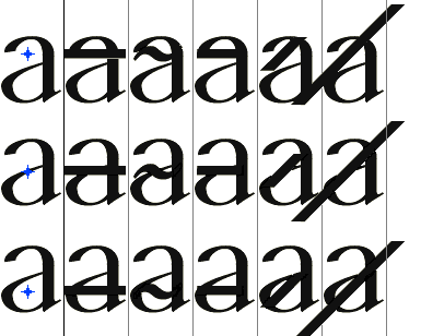
For the U+0334 to U+0338 Combining overlays, what is the prefered placement (or is there any?). Besides most fonts not really including them, it seems like those that do have either followed two rules in their placement irrespective of the form of the letters to be placed on. Eithe A- they remain at a consistent height both for letters with and without ascenders, or they are placed at exactly one half the total height of the character (making different heights for dotted and dotless lowercase I).
In both cases, a number of letters end up with basically invisible overlays, most especially those non-ascending letters with horizontal strokes in the middle (two-tier A, S, E). While I’m sure these are basically unused combinations, I wonder, what would the best placement options be for such a hypothetical character?
Here’s the three options I see for a two-tier A, and in all situations at least one of them appears nearly identical to the original. Maybe if each of the overlays has a very light negative outline? (not sure if you can have diacritics “chop out” their base glyphs anyways)