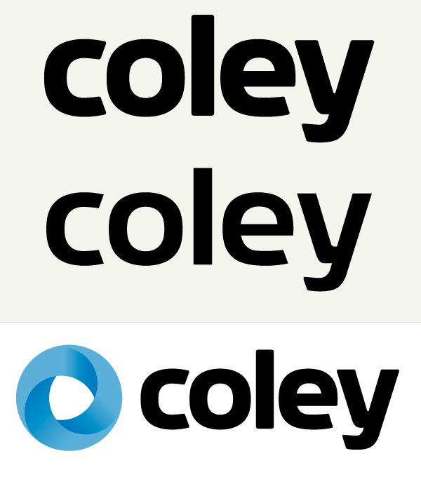
This is for a federal consulting company, who is adding more software to it's line up. They want an approachable, modern look but to keep in mind that they are still connected to the federal government (see gartner, input etc...). I couldn't find a typeface I was 100% happy with or could afford so I've tried to create my own. I'm looking for feedback on two things 1) how to improve the type, make it more distinct and weight you think works better and 2) Should I go with a wordmark or use the logo. The idea behind the logo is the have a win, manage, market philosophy that when used brings you back to winning a new contract and starting the cycle again, hence three parts that make up the circle.
Have at it.. Thanks