
Trying to figure out the font (or similiar) for
Maxim Magazine
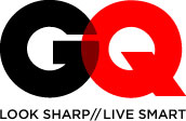
GQ Magazine
Motor Trend Magazine
Fortune Magazine
Rolling Stone




Trying to figure out the font (or similiar) for
Maxim Magazine
GQ Magazine
Motor Trend Magazine
Fortune Magazine
Rolling Stone

Rolling Stone is a custom job by the incomparable Jim Parkinson.
See his site for fonts close to it.

MAXIM seems to be Trajan.
MOTOR TREND seems to be Compacta.
Rolling Stone is most certainly custom. GQ as well.

The Maxim logo was drawn by Dave Farey. If it looks similar to the typeface Trajan, it's because it was also based on inscriptions on the Trajan column. Dave revealed in one of the talks he gave at TypeCon that it was right there in the stone:

That’s interesting, but still - the logo looks more like Trajan Bold (font) than the original engraving. ;-)
There are differences, though. So, you’re right about custom, Mark.
Top: Logo
Bottom: Adobe Trajan Bold

He may have started from the font, but I don't really know, other than what he said about the origin of the concept.
Captured from web.archive.org on 15 Apr 2012. view this capture