
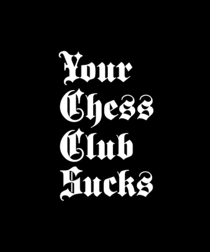
Before I go any further with this thing I was wondering if the kerning was alright? I think I'm kern challenged.
Before I go any further with this thing I was wondering if the kerning was alright? I think I'm kern challenged.
Looks good to me, but can I suggest abandoning the “kerning” idea and just judging letter spacing with the ideal of seeing it as even as possible. To that end you can use the old “Hand Letterer” trick of putting a piece of vellum over the type and penciling in the spaces between the letters. Relative weight can be better judged with a positive image, or so goes the old theory. Letterers did pen and ink headlines before Headliners or such. They worked for Ad Agencies etc. I fear a lot of their knowledge and tricks has been lost.
The second “s“ in Chess may look like it is wondering off a little.

The second “s“ in Chess may look like it is wondering off a little.
Now that you mention it... On the verge of an optical illusion; good eye.
Brilliant, thanks Olddog!
:)

The second “s“ in Chess may look like it is wondering off a little.
That's the first thing I noticed. "Su" might be a little close, too.
Thanks for the suggestion Craig :)
Captured from web.archive.org on 23 Oct 2013. view this capture