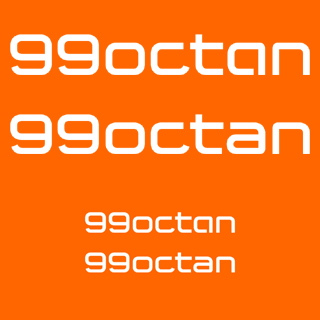
So I drew this, based on an existing logo (extended). I tried to make it a bit more tech-looking to match the actual name better. If I would have had the choice I’d have done something different, but - well...
It doesn’t matter much what it’s for. It’s all about matching the name.
So, what do you think? Any major flaws, or suggestions? Actually, I really don’t know if this any good or not. Any input welcome.