
Germany has a strong heritage of industrial typefaces constructed by engineers utilizing square and circles. DIN Mittelschrift is one very famous example.
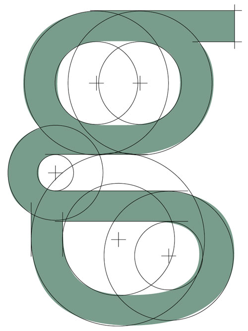
Since the »Romain du Roi« we know that it is tricky to draw a geometrical typeface. For optical reasons you have to go away from circles and lines with exactly one weight. Therefore the aim was not to construct a typeface but to draw it in a way that appears constructed. As you can see in the picture, the final typeface is very different.
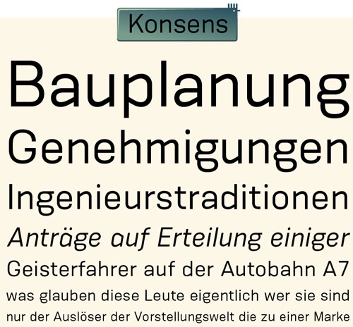
The design of a typeface is like stage production. Like strongly made up actors, the characters of a typeface must be super-elevated, to be very clear in there role. Particularly in small sizes.
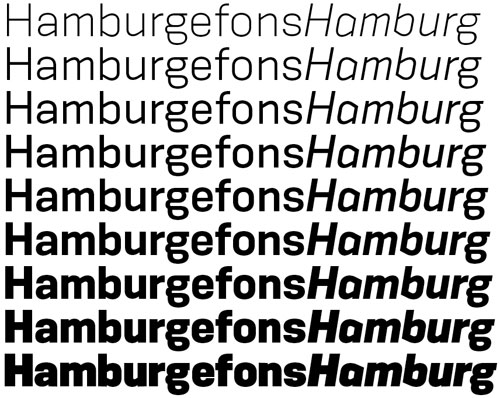
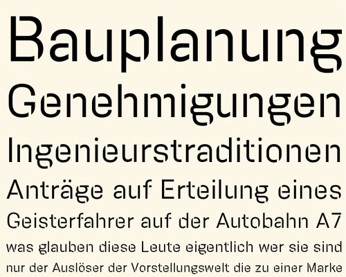
Konsens has 9 weights from Light to Ultrabold with italics like most of my other families. In addition to that there a Stencil headline companion. It also has got 9 weights but no italics.
www.hubertjocham.de/item.php/type/sans/Konsens/
www.hubertjocham.de/item.php/type/sans/KonsensSten/