Typophile

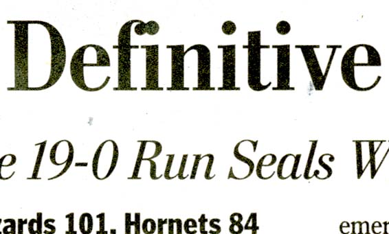
Great typography in the Washington Post :-/

Chris Lozos

It is bad enough when the Classified section gets suckful H&J and poor decision making in line length and leading--what can I say, there is a mortgage "crisis"--but when the the editors miss a crying need for a ligature in a story headline on page one of the Sports page, I begin to wonder where all those good typesetters I used to know have gone to retire. The Washington Post is not exactly some small town rag put together by cousin Jethro and Aunt Mae.

ChrisL
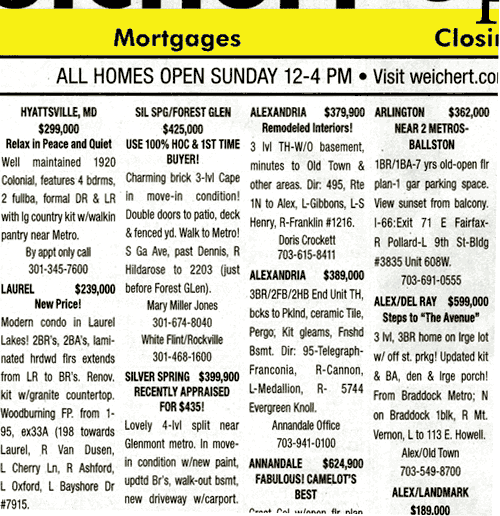
Forget H&J the classifieds need H&FJ.

:-) Perhaps even PB&J! I know your daughter could do way better!

ChrisL

Better than PBR!

I picked up an exhibition catalogue from a major museum recently and noticed no ligs, set in Adobe Garamond throughout. It was a sea of “fi”s crashing together. Demand for quality needs to come from the top down.

Chris, I have noticed recently that fi regularly has no ligature in headlines. I'm pretty sure that Matthew Carter's excellent headline font for the Washington Post, 'Postoni' (a Dezcom-worthy name!), has ligatures, so I don't know what's going on. I just looked and the text font, David Berlow's Bureau Roman, has a 'short' f so that no ligature is needed.

Wow, those classifieds look bad!

LBJ - "Any jackass can kick down a barn but it takes a good carpenter to build one."

So following that, a good jackass carpenter might be able to tear down a barn and build a better one in its place.

GWB - "We knock down barns over there, so evil-do-ers won't knock down barns over here."

Does GWB think his Barnes are Noble?

ChrisL

Chris, ironically, big newspapers can struggle with basic typography far more than small ones.
The reason is that a small paper can use Quark or InDesign, but a large one needs a pagination system, and these are typographically challenged (good typography is not their priority). So, no sophisticated H&J controls, no ligatures.

Case in point, the Seattle Times uses a version of Nick' Walburn, and I am ALWAYS seeing the fi issue. Nick designed it to not need ligs, but they track it so tight that it still smashes together.

I mentioned it to the head designer, and she said that because of their typesetting system (CCI) there wasn't anything they could do about it :(

Hmm this is quite interesting. For some reason, I always assumed that the major newspapers were typeset in Quark or Indesign like most other things. Is there a way to get to know these pagination solutions a little closer? Are there demo versions and trials, or are they strictly proprietary like the ripping stations?
_____________________________________________
Personal Art and Design Portal of Ivan Gulkov
www.ivangdesign.com

Hard to believe that huge news companies don't have composition systems that include basic typography elements.

ChrisL

Have you ever seen an italian newspaper? I mean, one of the major newspaper like "Repubblica". They use to stretch or compress types in headlines (Bodoni is one of the favourites for that treatment).

To whom it may concern:
This year’s Leipziger Typotage is about (changes in) newspaper typography.

Symposium on 26 April 2008 in Leipzig/Germany; speakers are:

  • Bernd Hilder (Editor-in-chief – Leipziger Volkszeitung)
  • Hans Peter Janisch (Freelance newspaper designer, consultant)
  • Johannes Janssen (Chief Layout Designer – Frankfurter Allgemeine Zeitung)
  • Brian O’Connor (Art Director – Handelsblatt)
  • Jay Rutherford (Professor Visual Communication – Bauhaus-Universität Weimar)
  • Manfred Werfel (Director for Research, Deputy Manager of Forschungs- und Serviceorganisation für die Zeitungsindustrie)
  • Eberhard Wolf (Art Director – Süddeutsche Zeitung)

> Hard to believe that huge news companies don’t have composition systems that include basic typography elements.

Not all that hard for me to believe, actually. Consider: Through much of the 20th century, the vast majority of newspapers used Linotype systems for setting their newspapers. As we all know, Linotype metal technology did not allow for kerning. Most faces included f-ligatures, but they were time-consuming to implement, so they weren't really used in newspapers. (Imagine if you had to actually type shift-option-5 every time you wanted an fi ligature, instead of today's software handling it for you.) But since Linotype f's were designed not to crash, it wasn't really an issue.

I can imagine a pretty straight line from that predominant newspaper technology through the development of digital pagination systems for newspapers, with the result that today there are still many such systems without the kinds of typographic niceties that we take for granted in other applications.

I'm not defending, just trying to reason out an explanation.

-- K.

"Linotype metal technology did not allow for kerning. "

I understand the culture being used to less-than optimal typography but I would have thought that implementation in todays world would be quite a bit simpler than it used to be. I know you are not defending, Kent :-)

ChrisL

I would be more concerned about the museum piece having bad type than the newspaper. Newspapers are massive products that undergo a 100% revision every 24 hours (or sooner). Quality may have been higher when craftsmen were doing the work, rather than machines, but it has never been a concern of the proprietors.

Ask at any newspaper how many proofreaders are left. If there are any, it will be less than 5% of what there was 40 years ago. Are reporters spelling better? I somehow doubt it.

Finally, I am reminded of a story about when the first pagination systems were coming out. Apparently the old time editor threw up his hands when the program hyphenated the word "God".

"how many proofreaders are left. If there are any, it will be less than 5% of what there was 40 years ago. Are reporters spelling better?"

Spell check has a lot to do with it, Don.

ChrisL

My thinking is that part of it is newspaper culture being accustomed to minimal typographic niceties. The other part is that the original development of pagination systems, following on what came before, probably did not put a premium on new features. There is a good chance that much of the layout infrastructure is still built upon something very close to the initial systems. The older and larger the paper, the more likely that would seem to me.

Newspapers are massive undertakings, with very intricate and interdependent editorial & design interfaces/workflows. I don't have first-hand experience with newspaper systems. But I would guess that implementing even very seemingly straightforward refinements might be more difficult than one might otherwise assume.

-- K.

I am seeing non-ligated fi and fl all over the place in magazines as well. Nature mag uses Minion and Whitney, which look great, but no ligatures anywhere. Are there a few common layout tools for mags? I would think they would be different from the systems at newspapers.

It would be interesting to examine the newer types designed specifically for newspapers by H+F-J and FontBureau; both have extensive experience testing and developing types for those systems, so I imagine they have dealt with this.

It's known as Sub-Prime Typography

«Spell check has a lot to do with it, Don.»

Why don’t they ever bother using it, then?

"Why don’t they ever bother using it, then?"

because they thought someone else already had :-)

ChrisL

With regard to newspaper pagination systems: these are primarily for rapid content management, i.e. laying out and co-ordinating input from hundreds of sources--writers, editors, designers, and of course the placement of advertisements. So any concerns a newspaper's design director may have about typography subtleties don't figure prominently. It's hard enough for these systems to get things like font names working correctly on all the different flavors of operating system and software that are involved; ligatures and proper fractions don't seem like an issue.

First, let's put a halt to all of the bad puns in headlines, then we can campaign against involuntary ligatures (like the unhappy marriage between the f and the i).

By the way, thanks for the explanation of why big newspapers are more likely to have these typographical problems. Sadly, it makes sense from a programming point of view.

A lot of the systems actually descended from pagination software that was never intended for newspapers or anything that remotely resembles fine typography. They mostly descended from the pagination software designed to layout phone books.

Think about how awful it would be to paginate a phone book by hand? I get nightmares even thinking about it.

So they developed the software to do it for them. That software then was picked up by newspapers originally to do classifieds. Before you know it, the entire works was dominated by the software, primarily because of a newspaper's primary source of revenue, the ads.

These systems are designed for the placement of ads, keeping track of ads, and billing for ads. Typography is far, far down that list.


Here are some of the "no lig" types I've done for newspapers--Chicago Tribune, Globe and Mail, Daily Express (Worldwide), and Nicholas (not for a specific newspaper).

The arm of the f has to work with the shape and position of the i (and j) and l (b, h, etc.)
It's actually not as difficult as it would be for a text type, as those have a lot of width to "f", and large features. So it's easier to tuck the ball of "f" and the dot together in display type. Nonetheless, it can sometimes be a bit of a trade-off, and I think the ball of the Chicago "f" and the ear of the Nicholas Bold "f" are a bit twee, but not hopelessly so, and they do combine neatly.

Ligatures may not really be appropriate for headline type, in as much as they are too fussy for news. So they have the opposite effect to their original function at text size. Is it possible that for ordinary readers the typophile-offending example Chris posted is fine, and a ligature would be problematic?!

IMO the ideal solution is a "ligature" glyph (or contextual alternates), but with non-ligating forms nuanced for good fit, but of course, that won't work with CCI just yet.

All of this reminds me of the newspaper ad that was obviously meant to be about black shoes and black leather jackets but ended up talking about "African-American shoes" and "African-American leather jackets". Someone had obviously done a global find/replace on "black" and hadn't checked the results.

(Reported on one of the Late Shows a few months ago — ie pre-Strike.)

"...so I imagine they have dealt with this."
Yes, and we determined that typography could be much better in news, the web, and other stressful typographic situations if 'we' could dictate from the architecture of the OS down to the template of the document, how type works. But, there are other 'experts' too...

"Forget H&J the classifieds need H&FJ."
...ohp, there goes one now.

"IMO the ideal solution is a “ligature” glyph (or contextual alternates), but with non-ligating forms nuanced for good fit"
As Nick's samples show, though excellence can sometimes be assured, this does not work stylistically across the board, or Matthew would have done it for the Post. The problem, i.e. is not the fonts. :)

Cheers!

I was very sure that the fonts were not the issue. I thought it was "pilot error" but it turns out to be more a "Ground control to Major Tom" issue.

ChrisL

I would also go for narrow f's in headline type, Nick. Sounds like a very reasonalbe idea.

It still does no good if they track everything so tight that they STILL bump into each other. THAT is is designer's fault. No doubts.

They mostly descended from the pagination software designed to layout phone books.

Interesting!

Captured from web.archive.org on 15 Jan 2011. view this capture