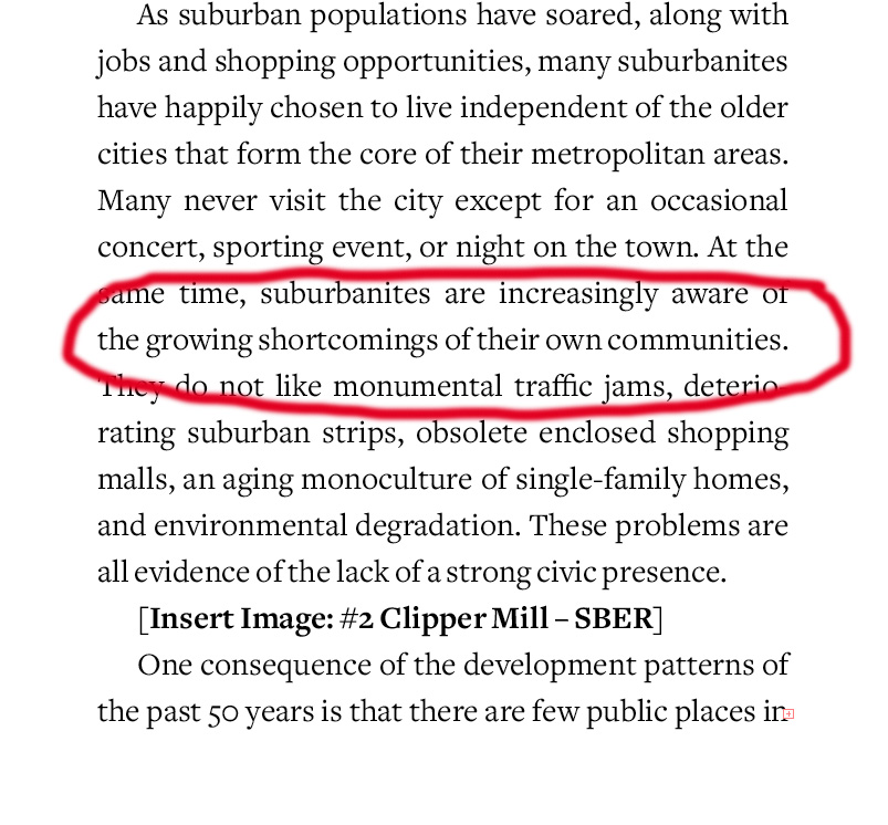
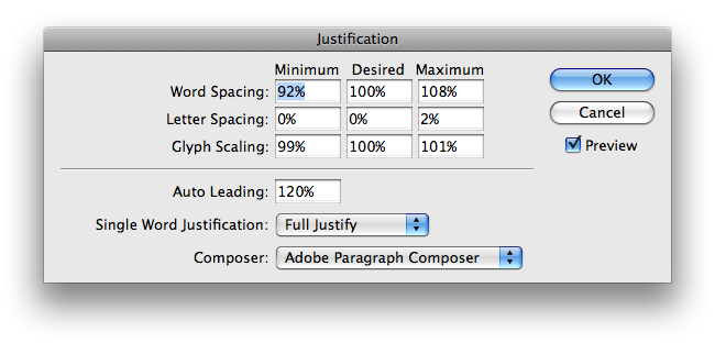
I just bought a copy of Freight Text on the recommendations of many people on here, and while I like the look of the font, I'm not at all happy with how tight it is allowing the word spacing to go. I don't usually spend a lot of time adjusting H&J settings, but I messed around with the ones I know about, and nothing seems to help. Just in the first page of text it is doing this quite often. See circled line in the image below.
Any ideas what I can do about this. Using InDesign.