
Recently I've been playing around with the idea of creating a font, and I decided to create a script font. Anyway, a picture is worth a thousand words, so here is what I've done so far:
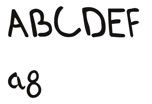
The letter next to the a that looks like a 8 is a g. Anyway, I've been looking at it, and it resembles Comic Sans MS―not a good thing. I could try rewriting it with a smaller pen width; or is it fine as is? Should I go ahead and finish it?
What do you people think?

