Any ideas?
Thanks!
~Wes
Any ideas?
Thanks!
~Wes

Looks like a very distressed and compressed Wedding Text.
I would agree that it could be a number of Old English-style fonts roughed up, but if you look at the two O's you can see the distressing is the same.
Wedding is rendered more narowly as a starting point. The lower case Es look similar as well. IDK, if I was distressing a font and then redrawing the letters I might or might not do multiple versions. I have not seen the movie. Do you know if the font appears in the credits or just the title?
I haven't seen it either. I was thinking it may have been done just for the movie. I think it's meant to emulate old silent movie captions.
And to look all churchy, which is very blood oriented. I've looked through some grunge versions but no match. It may be custom as you say. If it is out there, someone will find it.
Ding Ding Ding
That font name will look great in the thread title when the mods do the patch up.

beautiful.

That font name will look great in the thread title when the mods do the patch up. Oh damn, I'ma in trouble...
I knew it was out there.
Thanks, man!

"but if you look at the two O’s you can see the distressing is the same."
Damn! That movie just lost all my respect...not only did they use a free font (which, in and of itself isn't a crime), but...they couldn't at least tweak the two Os?
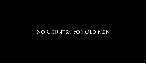
At least 'No country' tweaked the Os:
http://the-reviewer.net/wp-content/uploads/no_country_for_old_men_med.jpg
(I don't recall the actual film titles for that one, though...anyone have a screen shot?)

It's only free for personal use. Let's hope they settled up. I see there is a variation:
http://www.dafont.com/german-underground.font?nb_ppp=50&psize=l&text=The...
aluminum: They used moviefont #1, Trajan.
http://www.dvdbeaver.com/film2/DVDReviews35/no%20country%20for%20old%20men%20blu-ray/title.jpg
mrpallarp...interesting in how much the actually movie title and poster branding diverged.

It's usually that way.
I purposefully used a different typeface for my movie poster and the on-screen titles: http://malvolio.apartment32.com the poster, and the DVD cover will use a combination of Trajan and the hand-lettered logo seen on the site.
The movie will probably use Univers Bold Extended for the main titles, and I'm leaning towards Goudy Old Style, or maybe Caslon for the end credits.
- Lex
"Daniel Day-Lewis and Paul Thomas Anderson have made a new movie called There Will Be Blood, based on the Upton Sinclair novel, Oil. After seeing a special edition of Moby Dick, made by Arion Press, they called the San Francisco publisher of fine art edition books to make the title sequence for the film. Kenny Howard responded."
http://www.arionpress.com/news-notes/2007/10/kenny-howard-on-film-titles...
Captured from web.archive.org on 8 Mar 2015. view this capture