Typophile

The future of Cyrillics.

oprion

There is a discussion going on between Russian type designers over the future of Cyrillics. The main question, is weather the alphabet should continue on it’s 300 year journey of forced latinization (launched by Peter I) which so far has failed to produce a result comparable to the perfection of the Latin form, or step back to it’s scribal roots and branch off in a fit of free-form evolution to become it’s own thing. The problem, is that there simply isn’t enought variety between the letterforms right now, with miniscules being near copies of majuscules, and letters like ШЩЧЦ sticking out like sharpened rakes. What do you guys think?

It’s really hard for me to say, not speaking any Cyrillic languages. What do they plan to replace it with? The Latin alphabet?

> There is a discussion going on between Russian type designers

Where? who?

Those miniscules are vexing me too. And the kerning.
There are a handful of the Cyrillic miniscules that have forms close enough to Latin lower case that the Latin form is often inserted directly in fonts that have both character sets, but is this right, or do they need further adaptation?

Oh so much to discuss.

I echo David’s question: Where is this discussion taking place?

300 years is a long period for even an awkward, latinized Cyrillic to gain momentum. Is there any official talk of [re-]reform, or is this just a conversation between type designers? A few type designers are not going to force a revival of historic forms in general use, much as we might all appreciate them. A more complete cultural campaign could do it, but these days there aren’t many people like Peter I around to dictate such sweeping changes.

The trouble with the idea of ’going back to the scribal roots’ of Cyrillic, if one of the concerns with the modern script is the similarity of miniscules to majuscules, is that the reason for that similarity is the scribal tradition. Prior to the Petrine reform, the Cyrillic script was essentially unicameral or uncial, with very little case differentiation per se, only letters written larger or smaller depending on context. The process by which the Latin and Greek scripts developed bicameral alphabets never really happened in Cyrillic prior to the typographic period. What is that process? It is the gradual development of a relatively quickly written formal uncial that becomes the miniscule to a re-imported classical style that becomes the majuscule. And the context of the process is scribal book production. If you look for the parallel Cyrillic context, you find small and large letters both derived from the same uncial forms: the process has not had time to evolve a more independent formal miniscule, and there is no convenient classical style to provide a model for distinct majuscules.

Post-Petrine Cyrillic handwriting, on the other hand, has developed greater distinction between miniscules and majuscules, so might suggest a new directions in text type design. However, many of these distinctions are evolved from cursive speed, i.e. they are essentially ’italic’, and existing attempts to adapt them to upright forms look awkward to me.

Maybe this has something to do with something:

More like that over here.

The discussion is quite sporadic and unofficial. Held mostly on LifeJournal, in different designer articles and occasionally referenced in books.

The basic argument, is that the only way to really match the perfection of Latin forms, is to adopt Latin. Alternatively, the letters should move away in it’s own direction, and develop a unique aesthetic. Otherwise, it is often feared, that Cyrillic might remain second-best. This is certainly speculative and non-realistic, and there are neither the means nor the will to attempts these reforms. After all, some of us still lament the loss of ѣ (among others).

I am merely trying to decide, what would hypothetically constitute the best course of action in an ideal world.

_____________________________________________
Personal Art and Design Portal of Ivan Gulkov
www.ivangdesign.com

What makes the Latin alphabet so perfect that Cyrillic designers would want to emulate it more than they already do? From a graphic standpoint, Unified Canadian Aboriginal has a lot more going for it.

“What makes the Latin alphabet so perfect that Cyrillic designers would want to emulate it more than they already do?” -The fact that it’s already quite close to it, and thus gets constantly compared and judged against.

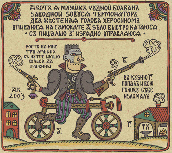
Hey! What a great lubok!
_____________________________________________
Personal Art and Design Portal of Ivan Gulkov
www.ivangdesign.com

John’s perspective sounds very convincing to me but I would like to see examples of your ideas just the same.

As quirky as Cyrillic is now and as laborious it is to kern, I don’t see a need to either return to older forms or adopt Latin script as the Czechs have done. Three hundred years of use has made it pretty ingrained by now and why confuse all current users even more. It isn’t an issue of whether Latin or Greek or Korean script is better, people just will resist change as readers.
For me, Cyrillic has its own charm and should be kept. I like the way it looks even if it is more difficult to design than Latin. That is the type designers problem and we can deal with it. Let’s not make it the reader’s problem just so we can tidy it up and save ourselves some work.

ChrisL

the perfection of the Latin form

? The Latin script is not without problems.

Sequences with vertical stems are dodgy: so you can get some words, like, er, Cyrillic, which go all op art in the middle, and loosey-goosey elsewhere, I mean, just how much kerning should there be in C-y?

And in many genres, (especially bold and condensed) diagonal lines are awkward—not a problem for Cyrillic!
As an aside, don’t those Constructivist-era posters look great with all their bold condensed rectilinear letterforms!

Also, Latin scripts require much more kerning than Cyrillic (or Greek), on account of the diagonals.
(Although Ge and Che, and Gamma, can be nasty.)

I would say Cyrillic type designers should continue to be inventive in adapting what they have, just as Latin type designers have added a tail to lower case “l” and “i”, in sans fonts, and employed the italic (monocular) form of “g” in types like Helvetica.

Recently, Greek type designers, with the “flipped h” form of lambda, have innovated to address the question of “problematic diagonals”.
I believe this was the same impetus that, over time, caused the triangular Cyrillic “De” to evolve to its present squarish shape.

The role of the gatekeepers (Maxim and Gerry, you know I’m talkin’ bout you!) in recent years has been interesting — it’s led to a lot of Cyrillic fonts produced by Western foundries, types that are “correct” but extremely conservative.

Alphabet reform has always been protracted and political, and given the vast number of players today, looks to be evoltionary from now on, rather than decisive.

***

If you are holding out the Latin form as being *better* than Cyrillic, take a look at the Bulgarian initiative — IMO, and as someone who has designed both serif and sans fonts to the Bulgarian spec, this Latinized Cyrillic is far from ideal, too “blobby”.

Of the various Cyrillic languages, Russian is the one with the fewest ascenders, descenders, and floating diacritics.
If Latin script is held out as exemplary, Bosnian and Serbian produce much better-looking continuous “normal” text than Russian.

In fact, this seems to be more of an issue with Russian, rather than Cyrillic per se.

“I don’t see a need to either return to older forms or adopt Latin script as the Czechs have done.”

Abandoning it is certainly not an option, it would be a chore, and simply drown in ugly diacritics. The current alphabet is quite nifty in replicating the phonetic language with it’s one letter per sound routine, so it has to stay. Nor, is it prudent to subject the folks to learn a whole new glyph forms (the number of people who read books is falling already.) But letter styles do evolve over time, and I feel there is still some room for Cyrillic to grow. I am merely trying to imagine a possible direction for that growth.

_____________________________________________
Personal Art and Design Portal of Ivan Gulkov
www.ivangdesign.com

Perhaps I misunderstood your original question. I thought you were talking about adopting a different script, not just evolving Cyrillic into something better. Latin has been eveolving for centuries albeit slowly. Cyrillic has had fewer centuries to evolve but it has to some degree includint dumping the yat. There will always be those who disagree with whatever change is made so acceptance is slow to come.

ChrisL

gatekeepers

Sorry, not the right word.
I took a seminar on Cyrillics from Maxim, and he was more of an door-opener, generous in sharing his knowledge, and very open-minded about design possibilities!

But here’s what I mean;
If western attempts at Greek and Cyrillic typefaces were occasionally “innovative” through a lack of knowledge, now it’s more likely they’ll be well-informed but careful not to put a foot wrong.

I wonder what Cyrillic readers think of western typefaces that make “mistakes”? Do they just look ignorant, or can they be useful?

And what is the opinion of Robert Slimbach’s invention of Cyrillic pseudo-Renaissance calligraphic forms in Arno?

I wonder what Cyrillic readers think of western typefaces that make “mistakes”? Do they just look ignorant, or can they be useful?

i think it depends on whom you talk to. with a recent project of mine that included cyrillics, several of the “old school” russian camp took objection to some of my design decisions and some younger designers outside of russia found the same design to be well put together and perfectly acceptable.

What sort of specific design issues are at play? I can only speak from my own experience and imagination, which are limited and outside any linguistic context respectively, so I would like to know a bit more about what I’m dealing with before I start slinging ideas around.

Looking at the glyphs you can quickly get a basic idea though. Obviously it cannot help but be naive if you are not a reader/speaker; but on the other hand I think if you have an eye you can start to see things. Optical issues are optical issues.

I will have to see the “pseudo-Renaissance” - that sounds interesting/fun/funny.

This is perhaps an especially silly idea but I wonder if the constructed/techy/wipeout/designers republic approach to latin might better be used with Cyrilic.

Perhaps even more silly, I also what a Chinese/ Japanese approach would yield if only because Chinese as it began was almost geometric and certainly mono-line. And it was a bit unlovely IMHO. The brush forms work way better because the tell tale features of the tool offer, as Peter Enneson might say: ’salient features’.

Optical issues are optical issues.

Yes, and getting relative proportion and weight right in Cyrillic is more demanding than in Latin because of the repetition of similar but not identical shapes. But the biggest problem that designers have when they start working with an unfamiliar script is lack of understanding of idioms. They see various shapes in various typefaces, and they quickly assume that these represent permissable or available forms without understanding their specific contexts. So they mix and match forms from different idioms. Imagine a designer with no prior experience working with the Latin script looking at specimens and deciding that he likes the shape of the y in Bodoni, and the shape of the a in Granjon and the little flourish on the p in Gill Sans Italic, and then incorporating these shapes or details into a single typeface, not understanding that they are particular to certain styles or idioms of the Latin script.

Of the many things I have learned from working with Maxim over the past decade, the most important has been this: to see and understand the idioms of Cyrillic type. And the benefit I have drawn from this is confidence in making design decisions.

Captured from web.archive.org on 6 Jul 2008. view this capture