
Here is something I have just begun working on. Only a few letters, but I would like to know what you think up to this point
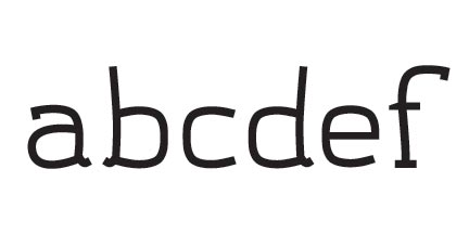
Here is something I have just begun working on. Only a few letters, but I would like to know what you think up to this point

I like it! Is is original, full of motion and yet - I think - adequate for text, and legible especially because of the light construction.
But don't take my word for that - I am not a professional typographer, just a part-time aesthete ;-)
I would like to see more of it, of course.
Maybe a question (which does not even amount to criticism) might be in order: does the lowercase b have to be an exact mirror image of the lowercase d?
Best of luck!
Ronald Kyrmse
ronald.info.ms

One can generate b,d,p, and q all by flipping the same shape around. This can be useful for comparing the weights of the individual glyphs for consistency, but it is generally regarded as bad practice with regard to actual design, but of course there are exceptions to that concept as well. It's not really a hard and fast rule; there could be some relationship to how the letters would be drawn by hand resulting in differing shapes for these similar letters. In a casual style such as this that concept probably should apply, whereas in a rational geometric sans (e.g., Futura, Avant Garde) it likely would not, or at least not as strongly.

The only thing I don't like very much is the way tails come out from the strokes. Or may be it's the way vertical strokes meet the rounded ones. I'd suggest you to check that.
Captured from web.archive.org on 24 Jul 2014. view this capture