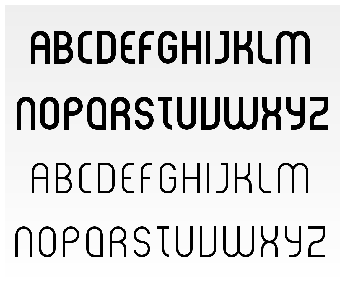
Fun little starter project you have there. A few tips: Where the circle sections meet the straight section, you should make the connection softer. Secondly: It seems that you have simply outlined a stroked path in Illustrator to create the letterforms. In this case stretch the letterforms vertically up by 10-15% before you outline the stroke, and then scale back down after outlining. That way you adjust for the optical illusion that horizontals look beefier than verticals. And yes, the S and Z are atrocious.
Hey all,
I'm a graphic designer and decided to try my hand at producing a font. I know pretty much nothing about how the whole process works, but would still like your critiques on where I'm at so far! Tell me what you think... any tips would be greatly appriciated.
Matt
P.S. I know the "S" and "Z" need some work... they're still a bit choppy.