Hi guys,
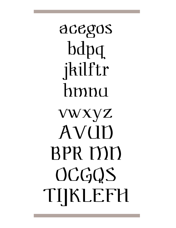
I'm working on this face and font for my senior project. I am using Modern and Blackletter influences. I can't decide which to continue to develop.
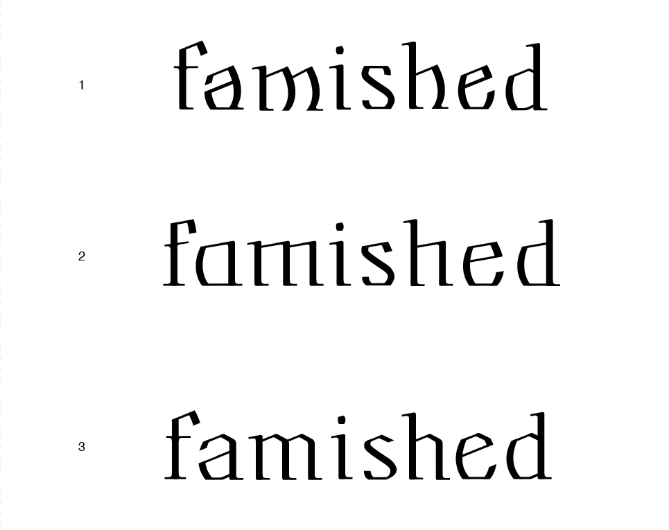
#1 is the original. It's really jumpy, and would only work as display.
#2 is not as jumpy, but looks simple and not detailed.
#3 looks more sophisticated to me, and is way more legible.
What do you think? Which has the most promise?
And also, if you think of any similar faces, please inform me. I don't want it to look too much like someone else's work.
Thank you,
Terrance
| Attachment | Size |
|---|---|
| three choices.pdf | 199.19 KB |
| terrance typophile sample.jpg | 203.06 KB |
| Untitled-2.jpg | 110.49 KB |
| Untitled-3.jpg | 188.7 KB |