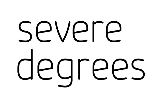
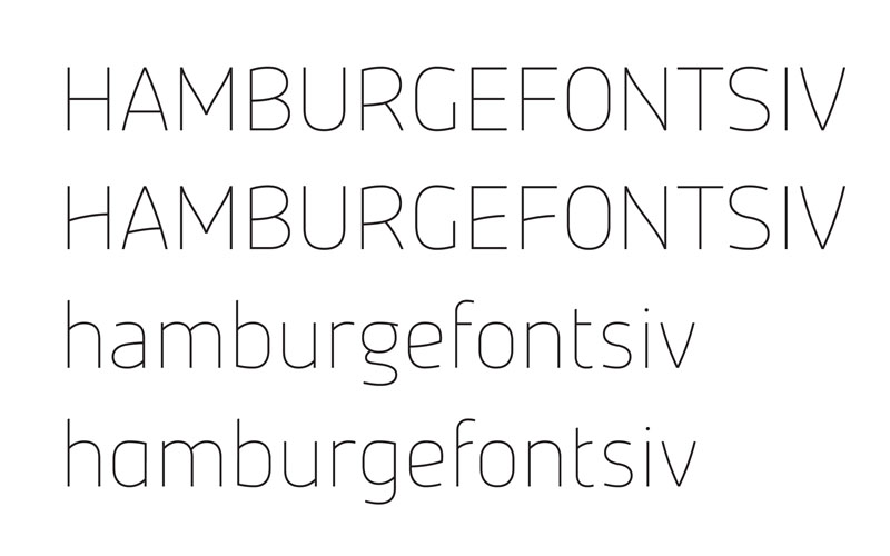
I've been considering this design for a while now. It's kind of an offshoot/development of an earlier design but I've decided to keep the same name since I never actually finished the last one - Magnitude. I've only drawn roughs of the thin weight and half of the black - my goal is to have five weights with italics and possibly alternates.
Below are some comped jpegs of the lower and uppercase, along with an earlier version vector test draw, rounded. The main features are the angled crossbars and curvature on certain glyphs. I'm unhappy with some of the glyphs so far (the g definitely needs reworked, maybe the M and a). I'd like to get some opinions on my creative direction and whether it's worthwhile pursuing this one.
I know the images are a bit rough so it may be difficult to get a decent idea of the finished type. I'll try to get some PDF samples (vector) uploaded as soon as possible.
Thanks!
| Attachment | Size |
|---|---|
| Mag08_Thin_Test.pdf | 235.4 KB |