Typophile

Max: Mens yoga shorts

djg

Need a bit of help..
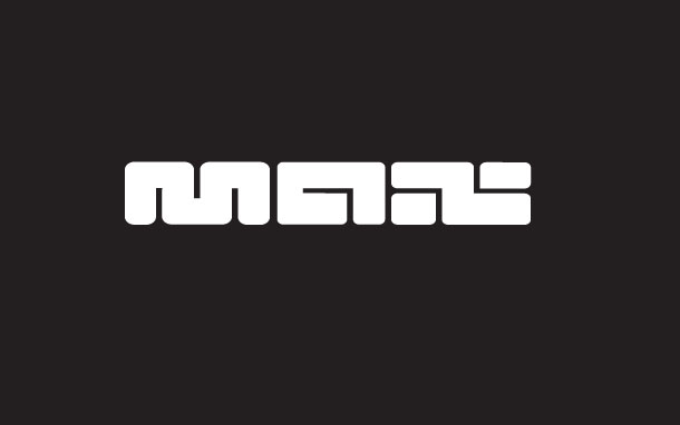
This logo is designed for a Men's spandex extra form fitting yoga short. Think speedo meets boxer briefs. I have been beating my head against the wall and maybe someone here can open a door for me???? My problem is the x and whether it is x enough or not.

AttachmentSize
Max1.jpg40.82 KB

It reads more as a z for me.

Yeah, it doesn't read as an x. It should be one piece, not 3. Two longer horizontal lines on the sides, and two shorter vertical lines on the top and bottom

That said, I think the concept might need to be addressed. Right now the lettering makes me think that this product might bend and squish my vital part into a rather uncomfortable position. Especially from the looks of that m--ouch!

David

I thought it said "MAN"

Reads man and/or max so you are ok. Best of both worlds. What about the words turned upside down and having legs dangling from the M because the M upside down looks like a pair of boxer shorts anyway. haha.

Here are my Yoga shorts:

http://www.sanskritweb.net/deutsch/baddha.htm

(Miss Tiffany had better close here eyes :-)

I believe Stefan is a spammer.

I agree with adnik the logo conjures up the image of a fat butt squeezed into an uncompromising space. This is maybe true for many taking up yoga initially, but I am sure the overall projected image should be what those going to yoga aspire to. Fit, sleek, this doesnt necessarily mean slim, but always well formed.

Remember this is more than typography this is branding, Stefan hit on another good point, the baseline for clothing branding is people have got to want to wear the brand, be seen wearing the brand, want to buy the brand and want to show off the brand. This is the premise clothing brands are built on, and when you have a particular focus like yoga pants, or indeed yoga, there is an aesthetic to aspire to. As a designer this is your target, to build, with what you create, as asset for your client.

Captured from web.archive.org on 19 Apr 2015. view this capture