Typophile

From Einaudi 1945

Eluard

Hello Folks

I wonder if you could help me identify the following font. It was used in Eugenio Montale's second book of poetry, Le Occasioni. It was printed by Giovanni Capella, and the publisher Einaudi has a Turino address. It was printed in 1945.

thanks Eluard.
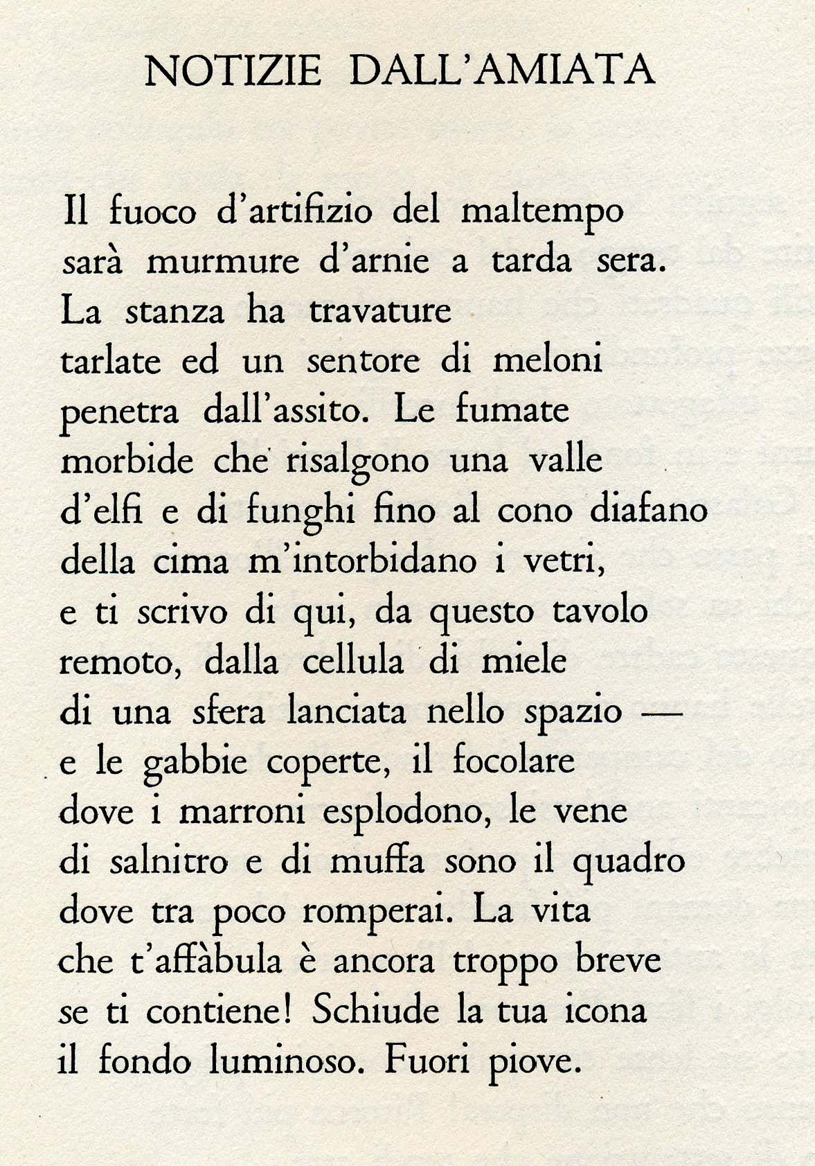
A version of Sabon, perhaps. The descenders are a little longer in this metal face.

Granjon could also be a match. It's more delicate than Sabon, but it's difficult to tell what the original type was like due to ink bleed and other imperfections.

Ciao,

I already asked for Einaudi's books typefaces. Someone told me it uses Simoncini Garamond.

Regards

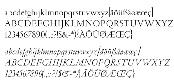
Simoncini Garamond, for comparison

As Sabon was released only in 1967 and Simoncini in 1961, I’d say Stempel Garamond maybe is the closest you can get with digital fonts.

Yes, Einaudi uses Simoncini Garamond. I don't know if it is a legend but I've read that Giulio Einaudi himself commissioned to Simoncini the design of the typeface. But I think it was after 1945.

Hi folks — yes, Einaudi subsequently commissioned Simoncini Garamond, but it was not drawn in 1945, as Florian has pointed out.

cheers

El.

My best guess, as I already told Eluard privately, is Ludlow Garamond. If anyone has a specimen I'd apprecciate a check on that.

Yes, I should thank Verbosus — he has already put in some time trying to identify this one. Consensus seems be *a* Garamond, at least.

Antonio (Verbosus) asked for a sample of Ludlow Garamond. This is from the Serif Font ID Guide and was made with the Red Rooster digitization done by Steve Jackaman. One difference that jumps out is the T. Your sample's A has a Caslon-like notch at the top that doesn't seem like Garamond to me either.

- Mike Yanega

Besides which, it would have been insane to set the text of a book with a Ludlow machine. :-)

Mark, you’ve got a point there ;-)

Looking at the various Garamonds the only one that doesn't have the stems of the 'A' meeting in a simple spire is Stempel Garamond — at least that is the only one that I've been able to verify from Bringhurst. But it doesn't have a notch, rather a planed-off slope. Does anyone know about letterpress Granjon? Could it be that?

The sample of Granjon shown in Jaspert's 'Encyclopaedia of Type Faces" seems to have a slight cusp to the right on the top of the A, but it's not the same as this one, and the E does not have almost equal arms. I don't think it's Granjon.

- Mike Yanega

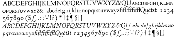
I started going page by page through Jaspert, and I think this is Estienne. It was designed in 1930 and all the details match. I think I have an image here somewhere.

- Mike Yanega

This image is from my Serif Font ID Guide, scanned from the Jaspert book.

[edit: Correction-- the scan is from Mac McGrew's book "American Metal Typefaces of the Twentieth Century" of the Linotype 1930 metal type.]

- Mike Yanega

I think you nailed it, Mike. Talk about a needle in the haystack, I don't know how you ever spotted it.

Respect!

Who designed Estienne?

MCGrew's description says it was "designed by George W. Jones, the eminent English printer, and released by Linotype in 1930. It is related to Garamond, but more delicate, with longer ascenders and descenders. ... It is named for a distinguished sixteenth-century French printing family."

- Mike Yanega

My hat is off to you, Mike.

Mike — I think you've done it! Many thanks — that deserves a beer at the very least. I've checked this against more letters not shown in the sample and it matches very well indeed. Great sleuthing!

Here is one that could well do with a digital revival!

cheers and thanks for all this effort — that is, thanks to everyone.

El.

You're welcome. I get satisfaction finding one like this, but I must say that coming to Sydney to collect that beer might be a fun trip!

Just a tip for future quests like this -- the Serif Font ID Guide could have found this. I tried using it after doing it the hard way, and Estienne was one of 59 possible choices, just using 7 characteristics from your sample. Most of them are obviously not good matches, which you can see at a glance. The only trick is that there is no short sample of Estienne, because there was no digital version for me to use to make one, so you have to open the full sample to look at it.

- Mike Yanega

Hi folks,
The font used for this edition of Montale's Occasioni is Granjon (metal). Einaudi uses Garamond Simoncini from 1958; a true digitalisation of the metal type designed for Einaudi by Francesco Simoncini at the Traldi Industries in Bologna (made by Apple Computers in the early 90's) is owned today only by those few who work for Einaudi. That's my case: I've got the MacOS and the Win Type 1 and TT version of the Einaudi Garamond font which includes also CE set and SC (known as Garamond-100) but obviously I can't distribute it. I do declare it's just of the best text font you can use on a QuarkXPress or InDesign layout!!
c.

Do you know what Granjon was used? Can you show us a sample of the alphabet? Estienne was based on Granjon. Other Granjon samples I have seen did not match the posted sample, in particular the long center arm of the E, and the ascender and descender length. The R of Estienne is also supposed to differ from Granjon. G.W. Jones also designed the Linotype version of Granjon shown in Jaspert and designed Estienne a few years later.

- Mike Yanega

I can't tell which kind of Granjon it is. I'm sure it's a Granjon because I know for sure that Einaudi printed books using only two typefaces before the Garamond of F. Simoncini: Bodoni and Granjon. I'll try to ask some old typographer of the Editor to get more precise information about the question (and maybe a sample of the alphabet).
c.

a further note on the einaudi garamond: it has really nothing to do with the simoncini garamond you can purchase for example from adobe, linotype, scangraphic, urw or e&f. this one's a real masterpiece, drawn so close to the metal exemplar.
c.

Cicciorli: can you get in touch with me privately? My email address and contact details are on my home page.

I'ld say: Stempel Garamond

Gruppe II - Französische Renaissance-Antiqua - Garamond (Stempel)
D.Stempel AG, Frankfurt am Main
Erstguß 1925
Rudolf Wolf

Georg
_______________________________________________
„Ich bin ein Preuße, kennt Ihr meine Farben...“

Sorry Georg, Stempel Garamond doesn't match at all!
the metal alphabet sample, quite beautiful, that you have posted makes me think to the scangraphic digital version (garamond SB) that I use sometimes
c.

Hi folks!
Is there a digital equivalent for the Estienne (metal) typeface found by Mike?
I like this font so much.

Thanks in advance

I suppose you would have to say that some of the Granjons or Garamonds mentioned would be close. I do not know of a digital version of Estienne. Unfortunately, there is another font (from Solotype) by the same name and it is nothing like this.

The design was created for Linotype, and so presumably they control the rights to it. Maybe a request for information about it would tell whether they have any plans to digitize it.

- Mike Yanega

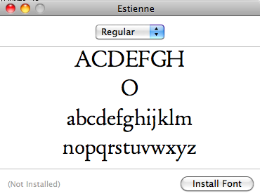
I started work on an Estienne digitization but only got as far as a-z and a few uppercase glyphs.

Maybe I'll have some time to work on it... but not any time soon at the rate things are continuing to pile up now :)

Thanks Mike! Great informations as always.
Raph: good work! Keep it up.

Hi Cicciorli, sono Manuel Dall'Olio, presidente dell'Associazione Francesco Griffo da Bologna. La stiamo cercando per una eventuale collaborazione sulla ricerca storica del lavoro di Simoncini, da inserire all'interno delle Celebrazioni dei 500 anni della morte Griffo.

Captured from web.archive.org on 17 Mar 2015. view this capture