Hello everybody,
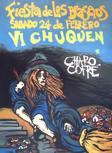
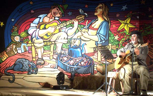
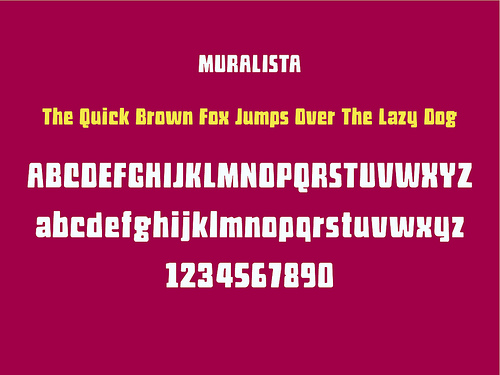
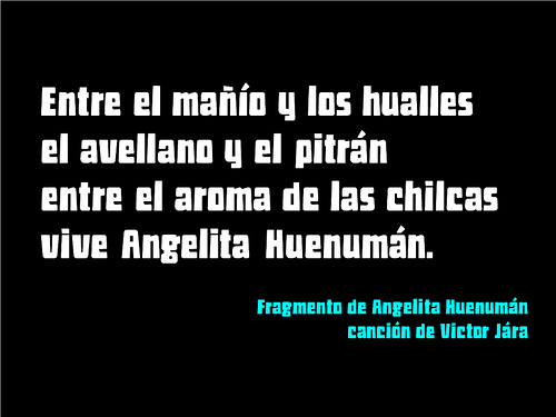
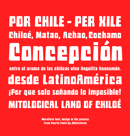
This is my typography "muralist," inspired by the work of posters and murals for 70 years in Chile. It is a font dysplay to short texts. I worked from sketches by hand, illustrator and then fontlab(I am learning to use ,XD).
He worked in relation to how the glyphs together and distances reading, but trying to keep the manual aspect of the muralists, it should work in large sizes larger than 18 pts. I hope you enjoy!
I can give your opinion
Jorge Cisterna from PuertoFonts
http://www.flickr.com/photos/jorgecisterna/
| Attachment | Size |
|---|---|
| muralista.pdf | 233.31 KB |
| prueba4.pdf | 290.02 KB |
| quick.pdf | 222.91 KB |
| 08 muestra.pdf | 24.32 KB |
| 08 muralista2.pdf | 27.61 KB |