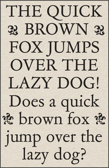
Hi, I'm nothing but a typography wannabe, but I find myself with a very strong opinion about a typeface lately, and I want validation of my taste.
So check this out:

This is a sample of American Garamond, or Garamond #3, or whatever the original name of it is, and its italic. I just got through reading three novels set in this, and I emerged with an acute desire to express my opinion on it, and solicit the opinions of real typographers to see if my instincts are good.
So. Before I opine, I want to know what y'all think. My sample text demonstrates what I want to point out, but I'm sure some of you guys have more extensive experience with this typeface to speak from. :)