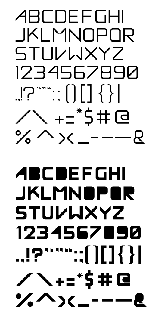
So I posted this typeface back in the summer and I received a lot of help and I think I have finalized it. I'm really happy with the letterforms but I wanted to see what some of you thought. It's obviously a display face and yes it does pay homage to Avant Garde. It was also designed based on a grid.
Let me know what you think. Thanks.