
What this sans-serif font name is?
Thank you
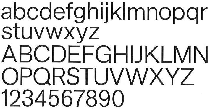
What this sans-serif font name is?
Thank you

Akzidenz Grotesk?
Nope, not 100%, at least not one of the versions I have access to. The ‘a’ is different, and a lot of other details (width of ‘P’ bowl, ‘f’, ascender/descender length, …)
Check for yourself:
Basic Commercial (LT’s AG), Akzidenz-Grotesk.
F

its not Akzidenz...even though 2 is similar..but 7 along with what Florian mentioned is different.
where did you find this example?

It’s like a lighter version of Gothic 725, and has a lot of similarities with Neuzeit Book...
It’s from “Grid Systems in Graphic Design” book by Josef Müller-Brockmann.
He says it’s a sans serif font by Berthold.

Well. it’s safe to say it IS some form of Akzidenz Grotesk as that’s all JMB used.
Nick Cooke
Brockmann? Then it is Akzidenz Grotesk.
Possibly a pre-digital version. Take into account that this family used to be quite patchworky, and still – even after GGL’s recut(s) and digitization – is far from being as systematical as Univers etc.
From the Wiki:
The original series remained quite divers, individual weights showing not much resemblance but in name. […] That only changed when they cut Series 57, and then Series 58, named for the years of release. These had some sizes (but not all) recut under the direction of Günter Gerhard Lange, who was their (freelance) artistic director at the time.
Captured from web.archive.org on 30 Jan 2008. view this capture