
Hi,
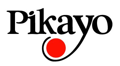
We are trying to id this font and although the closest is Garamond we fill that it could have been re-drawn or the designer used different fonts for different letters.
Thanks,
E.
Hi,
We are trying to id this font and although the closest is Garamond we fill that it could have been re-drawn or the designer used different fonts for different letters.
Thanks,
E.

Definitely multiple type styles thrown together here.
Top serif of the k is kinda off, too.

Almost looks like Goudy mixed with Clearface.
- Lex
Captured from web.archive.org on 30 Aug 2014. view this capture