
new decorative italic is published by Art.Lebedev studio
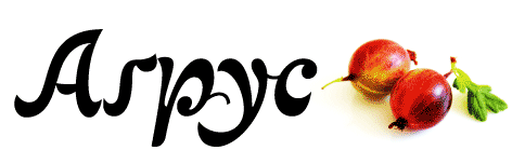
http://www.artlebedev.com/everything/type/agrus/
http://type.org.ua/agrus/
new decorative italic is published by Art.Lebedev studio

This is really lovely.
I'm sure this will seem naive. This really seems to have been designed first for Cyrillic and second for Latin. Is this true? Or am I just imaging the shapes.
Miss Tiffany, you right!
both scripts were done together, but cyrillic went to the step ahead
thank you!

Andrij, this is marvelous. Gooseberry indeed. Bravo!
thank you very much, crossgrove!

Hello,
I would like to know why the D looks like the one used in English (ou Latin languages) and not like a real cyrillic D (Д д)
It confuses me.
Thanks a lot!
:-)
hello fcsm,
it is not latin, but normal cyrillic script forms. pupils writes in elementary school some similar to this -Д-
Captured from web.archive.org on 16 Oct 2013. view this capture