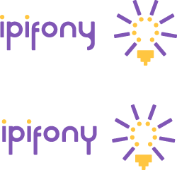
I would most appreciate your opinions regarding my logo.
The client, IPiFony, specializes in the development of software that enables hosted VoIP telephony services. Their customers, primarily, are regional ISP’s.
The concept for the logo is a light bulb formed from exclamation marks, with a cable jack at its base. The light bulb, obviously is a common symbol for a bright idea. I realize that it’s cliche, but I think it works here; it’s simple and memorable, and that’s often the best approach. The exclamation marks suggest the urgency / sudden realization that is an epiphany; furthermore, there are eight of them, which references the number of wires in a CAT5 cable (which is used to connect the phones to the network). The logotype is Mink (from T26) with numerous customizations. I believe it strikes the right balance between casual and formal, and appears sufficiently modern without looking trendy. For the “i” characters, I used inverted exclamation marks to establish visual continuity with the icon. The colors are Pantone Violet and Pantone 122.
NOW, the dilemma...
I have two versions where the only difference is the appearance of the “y”. The client prefers the first. I prefer the second. I believe the crook in the “y” is distracting, and leads the eye back toward the beginning of the type rather than continuing naturally to the icon. I like the consistency achieved in the second version by echoing the vertical descender of the “p” and “f”.
Please comment. I’d really like additional perspectives before I revisit this issue with the client. I really think I’m right about this, but I welcome your opinions whether you agree or disagree. Thanks!