
Can anyone help with the following examples of Italian typefaces? I'm hoping to identify both typefaces used in this beautiful signage. Thanks for the help!
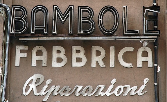
Can anyone help with the following examples of Italian typefaces? I'm hoping to identify both typefaces used in this beautiful signage. Thanks for the help!
All hand done and all wonderful.
Fabbrica - Similar forms in Amity
Rip - Consider Metroscript

Houschka Black is close for Fabbrica.
Nick Cooke

Nice picture! “Riparazioni” doesn’t look like a typeface: look how all the “a”s and “i”s are different.

For Ripararioni you might also consider Kinescope.
... and in some ways I am reminded of Base 9 Small Caps, except the I ... that's off.
Wow, you guys are good. Thanks for the recommendations!
For those who came here later, maybe via search: Neutraface (http://www.houseind.com/fonts/neutraface) has somewhat similar retro feel, although capital A is very different.

To be honest, I think that the digital format typefaces you mentioned have little or nothing to do – culturally speaking, with the styles of lettering samples in the photo posted by pcarew.
These are of course, example of custom-made lettering, and they are quintessentially italian. In such cases, if someone wants something similar, he might consider doing a research and design the letters he needs by himself.
I particularly think neither Metroscript nor Kinescope have anything to share with the style of the "Riparazioni" lettering line.
A side note: in terms of "handcraftedness" Houscka Black by Nick could do, as a starting point, because it's – of course – european more than "american".
Captured from web.archive.org on 23 Jan 2015. view this capture