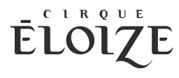
Ok, same logo, different story.
When it comes to type design, I find
it pretty difficult.
Please comment on the type.
| Attachment | Size |
|---|---|
| eloize2_1.jpg | 34.14 KB |
Ok, same logo, different story.
When it comes to type design, I find
it pretty difficult.
Please comment on the type.
| Attachment | Size |
|---|---|
| eloize2_1.jpg | 34.14 KB |

there's something not right about that q. the stroke is fatter on the lefthand side and it looks odd
Mikey :-)
It looks like drunk toothpaste.

Eric, this post would be better in the 'Critique' forum.
Nick Cooke

But Nick, it's not a font. It's a logo.
Or maybe I am not getting your point.
Eric do you have any updates???
Mikey :-)

I guess I like drunk toothpaste.
Captured from web.archive.org on 4 Aug 2014. view this capture