
http://movies.yahoo.com/movie/1809752801/video/6027003
I hope it's just a trick of the perspective, and they didn't actually use Eurostile Extended on the hull of the original Enterprise.
- Lex
http://movies.yahoo.com/movie/1809752801/video/6027003
I hope it's just a trick of the perspective, and they didn't actually use Eurostile Extended on the hull of the original Enterprise.
- Lex

Wouldn't you normally wait until the hull of the craft is complete before adding the paint job and name? That's how Boeing does things out here.

According to the Starfleet Technical Manual, the hull markings are in Microgramma Extended.
But that was for side markings and smaller signs. The original series Enterprise had something else on top of the disc section, a condensed bold Gothic of some kind. I'm a bit surprised to see Microgramma on top as in this shot. But then, there are a lot of subtle and not so subtle differences between this new movie model and the original TV design.
"It's a font Jim, but not as we knew it"
Yes, Starfleet Bold Exteded was a modified version of Microgramma Bold Extended with an outline, usually a red outline when used for hull markings (note the image of the back of the box shows only uppercase, distinguishing Microgramma from Eurostile). This is a later style that made its way into canon in the movies.

Wouldn’t you normally wait until the hull of the craft is complete before adding the paint job and name?
Given the size of the vessel involved, one could surmise that it made more sense to paint letters onto the hull panels before attaching them to the frame.
The panels themselves might even be different colours :-)
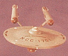
Here's the original:
And here's the CGI version from the remastered episodes:
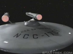
I think they had one of the original models for reference.
Does the technical manual only cover the original series, or does it include all of Trek? I'm pretty sure the use of Microgramma and Starfleet Bold (Millennium Bold Extended BT seems to be the same) only started in the movies, and not in the original series.
In any case, it's wrong and I don't like it!
- Lex
>In any case, it’s wrong and I don’t like it!
You can always report them to the Jedi council!
You can always report them to the Jedi council!
Maybe it's a Cylon plot to iniate Judgment Day :-)
- Lex

Does the technical manual only cover the original series...?
Basically, yes. It was issued in the mid 1970s (when the first Star Trek movie was barely a glimmer in Gene Roddenberry's eye), and most of it was based on the original TV show, which at the time was gaining in popularity thanks to syndicated re-runs. Some of the material, though, like the banners of the star systems that belonged to Star Fleet, was either new or previously unpublished. The same people who created the Star Fleet manual (Franz Joseph Designs) also came up with complete blueprints of the U.S.S. Enterprise from the original show.
Does the technical manual only cover the original series, or does it include all of Trek?
There was a later book called Mr. Scott's Guide to the Enterprise, which covered the changes made to the Enterprise for the first five movies, which is where I recall having read some of this information.
Oh yeah I remember seeing that one when I was a kid. I've only got the TNG technical manual. Interesting that Microgramma was being used all the way back then.
- Lex
Right you are, Cuttlefish.
Interesting that Microgramma was being used all the way back then.
And it looked so modern, too. :-)

More info on the Bitstream Star Trek fonts here (click da links), but unfortunately i was still writing in Dutch back then. :^/

No nerds in here, are there?
lol

I am not much of a trekkie but I’m actually looking forward to this. It will be interesting to see what JJ Abrams does with it. Let’s just hope it’s not as bad as Cloverfield, yes?
No nerds in here, are there?
Hey, all the uncool kids are doing it. :-D

Yeah, Cloverfield was a headache-inducing disappointment, wasn't it?

I enjoyed Cloverfield, but I can understand people having a problem with the camera work. I also liked the ST teaser.
I've got a copy of the Star Fleet Technical Manual from the Seventies and I can confirm the Microgramma reference. (I also have the set of blueprints of the Enterprise from back then, too.) (Me, a Trekkie? Never. :-)
FWIW, Eurostile (set in all caps) can be substituted for Microgramma. The caps are identical. Both were designed by Aldo Novarese.
BTW, the ST Technical Manual and Mr Scott's Guide to the Enterprise are both considered "Taboo" by the folks who own/run the license (Paramount). They usually only bless the newer stuff (written published after TNG started up), and 90% of that is by Mike & Denise Okuda (Mike is responsible for most all of the graphics on next Generation/DS9/Voyager/& all but the earliest movies). For example, all of the condensed fonts in TNG displays/signage looks like compacta, but it's actually Corporate Condensed (which I always found funny for a Trek universe).
I’ve got a copy of the Star Fleet Technical Manual from the Seventies and I can confirm the Microgramma reference. (I also have the set of blueprints of the Enterprise from back then, too.) (Me, a Trekkie? Never. :-)
I managed to lose (sell? give away?) my set of U.S.S. Enterprise blueprints from back then, but I, too, still have my copy of the Technical Manual. Even as a teenager, I noticed things like the name of the font Microgramma. Let's just say I found that kind of stuff... fascinating! :-D
Wasn't there a page that diagramed the Alpha Centauri script version of Microgramma? I seem to remember that page in the technical manual.

I love that this topic is getting so many informed responses. I used to pore over the Star Trek Encyclopedia with my brother when we were young. By the way, when I say young, I mean during the early seasons of The Next Generation.
Also, I really enjoyed Cloverfield, in spite of the camera-in-a-dryer shooting style.
> Wasn’t there a page that diagramed the Alpha Centauri script version of Microgramma?
Yep. It's basically a badly drawn Greek version of Microgramma. Funny detail: "Earth Font Name: Microgramma Ext."

My mother trashed almost all of my Star Trek:TOS stuff when they moved in 1980, but I had an original set of plans as well -- at least she never got her hands on my Official Star Trek Cooking Manual (sanctioned by Paramount, no less).
And where, in light of Robbie Burns Day on Friday, is the only cookbook I have with two haggis recipes direct from Montgomery Scott! :-) (Not to mention how to make Plomeek Soup and Saurian Brandy!)
Captured from commoncrawl.org on 21 Apr 2015. original URL