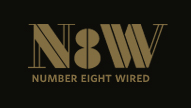
Hey there, Im in the process of building a portfolio site and identity for my design (mostly web) services. Its called “number eight wired” based on the New Zealand phrase “Number Eight Wire”. (Im based in the UK though)
“Number Eight Wire is a metaphor for Kiwi ingenuity and enterprise: the ability to achieve or build anything out of a piece of number eight wire”
So this is where Im at, Im not sure why i have arrived at this point, but Im mostly happy with it and am looking for some typographic critique, (not so much conceptual critique).
The N and W are built from Didot and the 8 is based off stencil forms (P22 Albers) because that was the only style of 8 that I could match with the stencilish/rectalinear nature of the N and W. (the Didot 8 wasnt working at all)
Theres something happening with the 8 when i first look at it that make it feel like its actually the negative space of an eight????
cant decide if this is good or bad or if this can be worked off.
the small text below it is set in Whitney SemiBold SmallCaps , which Im currently using sitewide as body text (Im an big HTF fan)
thanks for any comments in advance,
g