
Hi guys!
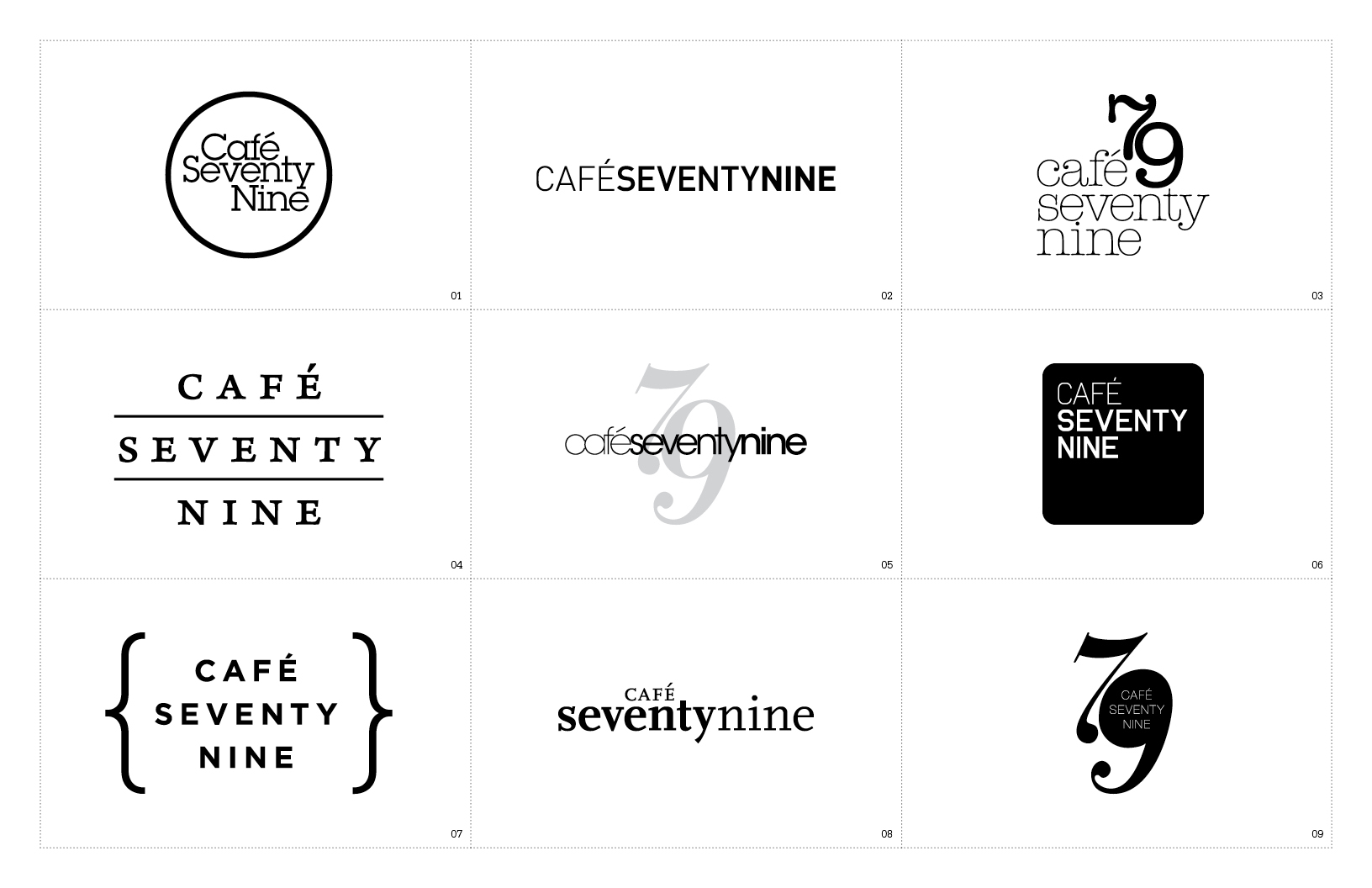
I need your help narrowing down my logos! Pick one that you like the most and tell me on how I can improve it.
Thanks!
Hi guys!
I need your help narrowing down my logos! Pick one that you like the most and tell me on how I can improve it.
Thanks!

Any background on the client? Is this an actual restaurant? If so what kind of food? Is it upscale, homey, hip?
Hard to judge without knowing a bit about the intended audience.

I know it's a little trend at the moment, but personally I would avoid the brackets. They may be a nice decoration, but they are also unnecessary punctuation.
This is just for a school project. The cafe is more upscale and hip. The cafe will be like Starbucks but they will have more selection of gourmet food from sandwiches, soups, snacks, and baked goods. Very similar to Eat. http://www.eat.co.uk/
Thanks for the advice The Don.
I see where Don is coming from. Jumping on a trend bandwagon isn't the best way to an original logo that will stand the test of time (see Xerox), but I think the simplicity of these sans brackets is clean and unique enough.

I like where 01 is going. If this is to be a café in London, I'd think a slab serif would make it stand out more from all the other sans serif shops and such. I would change the spacing though. "Café" should be the same distance from "Seventy" as the space in between the baseline of "Seventy" and the x-height of "Nine".

just looking at 01. I find the rectangle created by the "af" very distracting.

I noticed the rectangle thing too. I like 02, but I don't know if it's because I've seen something like it recently. Good work though! Very clean stuff.

I can't see your images. Make sure they're RGB.
- Lex
I think 3,4, & 9 have the most personality.
Also... if the lines in 4 were thinner, I think it would read better. Right now, its almost "Seventy Cafe Nine"
Good luck!
I like 1 the best, but I agree with Robert about the rectangle. Lose the top-right serif on the 'a'.
- Lex
i like 3 the best
btw, what font is that?

I would try to keep a visual relation between the letterforms and other graphic elements. For example, your bars and lines should have either the same or a proportional stroke weight to the strokes on letterforms.

I think I'm pulling for 5, 7 and 8.
For #5: I love the screened back 79 and the variation in weight. I would maybe try the same treatment in small caps with a different font. Maybe Gotham HTF or something of that nature and Kern it out a bit. But it's a nice design.
For #7: This is my favorite. It's very clean and modern with the brackets containing things nicely and giving a slightly organic elegance to the whole composition. Maybe also try this treatment with a box around it instead of the brackets just to see how it works. Well done here.
For #8: I again love the variations in weight and the small caps of the Café on top. Nicely treated with it bumping up to the 't'. And you did a nice job maintaining a good evenness of the air around café on the bottom and right. Maybe try one with seventy in the same font as nine but in a heavier weight.
Beautiful treatments all around. I think that's DIN in #2, is it not? One of my favorite fonts, but a bit too rigid and technical for a café.
I think you've done splendidly with #7. My favorite hands down.
Mind if I ask what font that is?
Captured from web.archive.org on 24 Aug 2013. view this capture