Hello Typophiles!
I never thought a sans serif would be so difficult until I tried it for the first time! I worked on this typeface for about six months now, just tweaking, scrapping, re-doing, and more tweaking. I have a rough set of uppercase characters and numbers, but I want to present the lower case characters for now as I feel it's closer to completion than the rest.
My intention is to make a "food" font, where the typeface will look good on food & beverage products, restaurant menus, cookbooks, personalized recipes, etc. I used keywords such as homestyle, aroma, fresh, delicious, tender, sweet, and organic, and tried to incorporate those qualities into the letters. At the same time, legbility is very important where text is versatile enough to be read from caption sizes to headers. It might be difficult to say that a typeface could be made for a specific use, so maybe this shouldn't be a "food" font as it is inevitable that the personality of the face could be applied to other projects and subjects?
I created Whisk in TypeTool and I haven't worked on the kerning sets yet. If it's something that should be pushed further to a family, then I'll upgrade to FontLab.
My biggest challenge is creating a typeface that is different from all the other sans out there, but at the same time, I would like a set that appears to have the same "genetic code," to be highly legible, and to conform to my goal of creating a type that is applicable for a specific category. Right now, I need fresh eyes and a new perspective, so I really appreciate any feedback, and if possible, a critique. Thank you!
Joachim
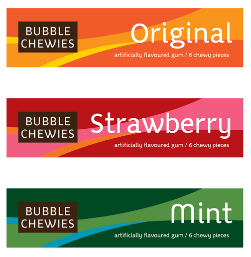
Updates: Whisk set v3, and 2 samples of it in use.
| Attachment | Size |
|---|---|
| whisk set v3.pdf | 25.75 KB |
| bubblechewies.gif | 31.94 KB |
| whisk menu.pdf | 28.41 KB |