
I'll eventually get to the part where I see a book set in Georgia. But first, some background...
Imagine having to typeset a book in a language--and script--that is not your own. That is the challenge faced by Korean publishers who opt to publish books targeting non-Korean readers, ranging from coffee-table books on Korean palaces to academic works and dictionaries. The vast majority of these books are in English.
The vast majority of these books also suffer from typographic deficiencies stemming from a lack of familiarity with latin-alphabet book design. Many of these are subtle, and even books published in English-speaking countries are not immune to such problems. However, the most visible indicator that an English-language book sitting in the foreign books corner in a Korean book store came from a Korean publishing house is that they use system fonts.
One treatment that I can't stand is the use of latin glyphs that come with hangul system fonts for setting whole books. Now, hangul fonts include latin glyphs the way latin fonts are expected to include glyphs for numerals. However, most hangul system fonts have mediocre latin glyphs, often with serious spacing problems and squished proportions.
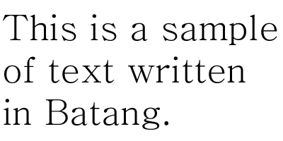
Batang, the default hangul serif font for Windows users, is actually not even close to being the worst offender (at least it's not mono-width). But a sample should be enough to show that it is too light and the descenders are too dramatically shortened to work well for latin book work.
The standard of latin portions of commercial hangul fonts has improved quite a bit in recent years, but I don't remember seeing them in English-language books. Maybe that's because if publishers are savvy enough to use commercial fonts, then they would be using latin-centric fonts in the first place.
So it is with some relief, however ironic, that I see books set in the ubiquitous Times New Roman. Quite a lot of Korean academic publishing uses Times New Roman. I think I've also seen Palatino.
Now, add to the mix... Georgia! The web's favourite serif has been added to the palette of Korean English-language book publishing. A couple of days ago, I spotted in a Korean book store an interesting paperback volume called Dawn of Modern Korea: the Transformation in Life and Cityscape by Andrei Lankov. I picked it up, and lo and behold, the text of the book was set in Georgia.
I was pleasantly surprised by how Georgia worked as a book face. The dark colour certainly helps, especially compared to the spindly latin letters of Korean system fonts. The old style figures are a definite plus.
It does show that Georgia has been designed for a medium that doesn't reward subtle details, but that doesn't matter, because the simplicity of the finish is integral to the design, and the letterforms are basically indestructible.
I wish I could compare it with Miller, the typeface designed for print that Georgia was based upon, but I've never seen it printed. But Georgia holds up well in print, much better than one might expect.
I wonder if others have seen or even used Georgia in print work. Is this rare? It is, after all, a system font. What are your thoughts on this? I still don't think I would use Georgia as a first choice for book work, but if I suddenly find myself restricted to using system fonts for book work, I think I've found my workhorse.


