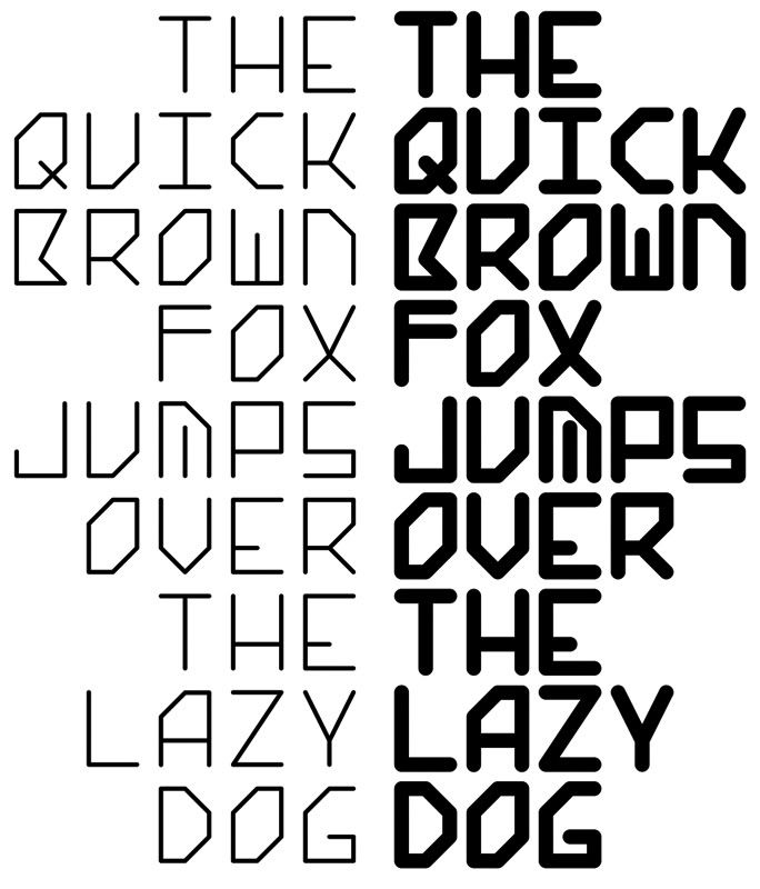
ok, sorry, link didn't work. here it is:
http://i174.photobucket.com/albums/w88/varultz/CPD_SolidState_Sample.jpg
I also forgot to mention that i only have TypeTool 3, but this sample is straight out of Illustrator.
Hi All,
Here is a typeface i'm working on. I'm very new to this, so any tips would be great!
The intention for this face was to create some using a 6-square grid (2 columns of 3 squares) to create each chatacter, also i was thinking of making it mono-space, but seeing it in action makes me think that is not a good idea...
I'm doing this mostly to start learning the art and craft of type design, but i do intend on using it in designs to see how it holds up.
Thanks heaps!
ok, sorry, link didn't work. here it is:
http://i174.photobucket.com/albums/w88/varultz/CPD_SolidState_Sample.jpg
I also forgot to mention that i only have TypeTool 3, but this sample is straight out of Illustrator.
The M gets iffy in the bold weight. I'd fudge the top end of the center stroke for better negative space. Or just connect it.
The inconsistency between B, R, P might be less ideal.
The 'X' is not really working, in my opinion.
thanks for the feedback!
i was already thinking the same about the bold M.
thanks heaps - sye :)
Captured from commoncrawl.org on 19 Apr 2015. original URL