
Check it out - got a bit of a cricket vibe if you ask me...
http://www.xerox.com/assets/sneak_peek/index.html
http://www.xerox.com/go/xrx/template/inv_rel_newsroom.jsp?app=Newsroom&e...
Check it out - got a bit of a cricket vibe if you ask me...
http://www.xerox.com/assets/sneak_peek/index.html
http://www.xerox.com/go/xrx/template/inv_rel_newsroom.jsp?app=Newsroom&e...

I don't mind the lettering or the site design. But the ball & x don't seem to quite gel...
The curvature on the x reminds me of some of the proposals we had developed for the xbox 360 - but all lc will take some getting used to - I think of Xerox as an all-caps kind of company ;-)

I wonder why they put such a thick stroke on the ball. Really shouldn't be needed when there is a gradient on it.

Bocce anyone?
>Bocce anyone?
It takes balls to make a suggestion like that! ;-)

The ball is a bit too close to XBox, I think.



Right Zara--a rotated view.
They must have known, but figured this kind of thing is OK today, because, copyright is like, for losers.
Why do they need a logo to go with their wordmark anyway, with such a distinctive brand name?
I guess because they're not in the xerox business anymore, and are now providing customer-centric solutions.

I do not wish to derail this thread, but I think they really botched that one up. And seriously, it will be interesting to see how they use this beyond a logo.
I think the ball owes something to Swiss soccer...
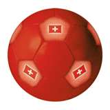

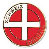
And bringing this back to type...
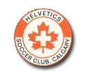

"Why do they need a logo to go with their wordmark anyway, with such a distinctive brand name?"
that seems to be the trend today. Come up with a nicely modernized wordmark, but be sure to slap some sort of 3-d widget on the end just...because.
I like the new wordmark.
And agree the ball would be great for my summer bocce league.
that seems to be the trend today. Come up with a nicely modernized wordmark, but be sure to slap some sort of 3-d widget on the end just...because.
you mean like this?
http://www.creativepro.com/story/news/24059.html
or this?

Just looking at the word mark, there is a problem in that xe and ox fit nicely, but the r has much more open space on both sides. Thus the middle has lighter 'color' making the r and the word mark overall look weak.
The old mark solves the problem by using all caps and a square look. It's a bit dated, but at least it looks good and strong throughout.
On the other hand, the lowercase allows the almost-palindromic character of the name to come through more easily, since e and o are more similar than E and O (even if you try to square up the O as in the old mark). Since "xerox" has come to copying (esp. by machines that go back and forth as they scan), that's a happy feature of their name that they do well to capitalize upon.
OMG. We'll look back at this era in 20 years and talk about how bad it was for identity design. The same way we talk about what the 70s-80s did to architecture.
Was the Geffen logo the first "letter on a sphere" logo? -- I vaguely recall it back to the 1980s, and animated even.
Looks like the 3D sphere was there from the beginning in 1980...
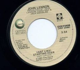
Not sure when it went 2D as it is now...
of course the origins were from the 70's... (sans letter)
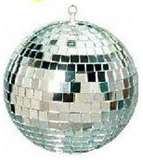

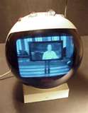
>We’ll look back at this era in 20 years and talk about how bad it was for identity design. The same way we talk about what the 70s-80s did to architecture.
Nice insight, Stephen. I just keep being amazed that one big company after another replaces their logo with a new one that is embarrassingly weak or cartoonish or both. This stuff must look good to a lot of designers now.
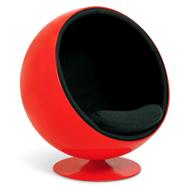
Back on type - BizWeek reports the logo font is "FS Albert" which seems to be the text face...
http://www.fontsmith.com/images/pdf/fs_albert.pdf
Si

We’ll look back at this era in 20 years and talk about how bad it was for identity design.
Absolutely. All these retooled logos are starting to look the same...
This stuff must look good to a lot of designers now.
I'm not sure graphic designers are doing this, William. It might be branding "experts" that are behind this trend... Who needs designers?
How well does that logo photocopy?
I think you'd need a high end... color... copier... duh! The real reason they went with 3D orb!
Si must be correct. Create needs & then sell to them...

I like the logo lettering and the type selection. But that ball is really ugly and has nothing to do with xerox brand i guess.
Btw, who has done the branding?
Okay, I found it myself. It was done at Interbrand.

Looks more like a Swiss flag than an X to me. What does Xerox do these days, anyway? Do they do more than make copiers?
ChrisL
They make Christmas tree ornaments, too, apparently. ;-)
Apparently they don't make copiers any more.
Chris, sorry about those Steelers - I guess we won't see a repeat of Superbowl XL this year. :-(
Thanks, Si. The Steelers need some new offensive linemen if they hope to compete. I, on the other hand, have had many offensive lines :-)
Best of luck to your Seahawks, I will be pushing for them as the NFC winner!
ChrisL
Also check out the level of hyspheria (hey, a new word!) over here... http://www.underconsideration.com/brandnew/archives/xerox_the_very_very_...
That is funny. Xerox redesigns hoping to get away from the company brand not saying "copier" or "copies". But did anyone bother to tell them it was actually the company NAME that said those things?
Michael Bierut: "I wish I were dead"

On the whole, I like it a lot. However, the e sticks out to me. Not only is it uncomfortably wide, comparatively, but it screams humanist face whilst the rest of the logotype is considerably more modern in its architecture.
I always liked the R in the previous version of the XEROX logo.

And I agree -- the ball does nothing for the integrity of the company.
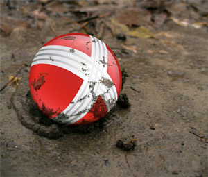
Regards,
Ray

Oye Interbrand. One more rebranding hack to add to the pile. It's so very 2007. But wait...where the hell is the reflection? Who FORGOT THE DAMN REFLECTION!
hyspheria (hey, a new word!)
Awesome, Si. :-D

I thought it reminded me of something.

What is it with the mooshy branding these big guys are going for these days? Curvy lower case x's for Xerox (Or should it be "xerox") Next thing you know, "Big Blue" will be "poofy blue" with "IBM" in a powder blue stripy Cooper Black (BTW - I got dibs on that until I hear from IBM)
-=®=-
Hot cross jellybean.

Have they been bought by GE? They have certainly tried to emulate GE Inspira. Or is that a new trend? Harmless, cuddly, rounded typefaces for big scary multinationals? In wimpish colours? This is GE Inspira Regular (by WolffOlins with the help of Mike Abbink):


Check out the Xerox logo history all the way back to 1906.

>> Ken, that comment about the reflection really did have me laughing out loud.
I say, take Photoshop away from every designer for at least a year, and for that matter After Effects as well.

I believe the esteemed Ray Cruz extended the old Xerox logo into a typeface for use in their ads. Perhaps now he can use his time-lapse light wands to swashbuckle a typeface to go with the sphere. If so, then this iteration is not only justified, but welcomed. (not holding my breath)


What did they sell in the 40's?
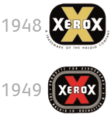
Naughty Movies :-)
ChrisL
Nick, I love your proposed new typophile logo.
Back on type - BizWeek reports the logo font is “FS Albert” which seems to be the text face...
Is is supposed to be Xerox Sans; looks like a name change from FS Albert, and I hope that Jason was involved and not someone who just cloned his font. Still is the same style as GE Inspira for GE. And the same colour range.
Yep and the press release talks about a 'proprietary font' too. I'll send mail to Mr Smith asking him for the low-down.
Nick nice, but it's already been done...


Satya, is that you on the right? How much for a GW Bush air national guard memo?
Supporting font family isn't straight FS Albert. Among other things, the 'd' and 'l' have little hooks. Gotta be the work of Fontsmith though surely.
Indeed Fontsmith has created a version of FS Albert for Xerox. We did some customisation of the design and made Greek, Cyrillic and condensed versions. Enjoyable work, and look out for FS Albert "Pro" sometime in the future!!
jason
Jason, nice to see you here with us.
I also liked the custom typeface you did for Channel 4.
Came across this today


Wow, it looks like FS Albert is cross platform!
(I kid. It's a lovely typeface. Jason, could you suggest that Xerox get rid of the bocce ball?)
A reminder: FS Albert is a supporting, corporate typeface, not the lettering used in the logotype.


Priceless, Dan :-)
ChrisL

Xerox trashed a great mark (the digital X) for disposable, hard-to-reproduce, garbage. Interbrand, why?
I don't mind the type, but the little widget is such an ugly little sphere. That x banding may be technically accurate (not sure) but who cares? It's so awkward. If this was student work, it would be destroyed at a critique. In my opinion, it fails in every way, except at aping trends.
::deep breathing::
But why would Xerox care? Put it on 1MM new copiers and it'll creep into the mass consciousness...right next to their digital X mark.
ChrisL
It could definitely pass on as a gas station..

We need a crap logo dead pool.
But seriously, the current logo trends are going to make me rich. I’m going to plagiarize everything the Vignellis wrote about brand equity. Then in ten years when all the firms with cheesy 3D logos want to go back, they’ll need to hire an expert in brand equity to tell them go back to an old corporate identity. “That will be three-hundred thousand Euros please, now here’s your old logo I archived off brandsoftheworld.com back in 2008.“
I don't like it. Too xbox360. They are an older and respected company and the new logo is not reflecting that.

A quote from this thread has been ripped from it’s context and Twitter’d here: http://www.twitter.com/typophile
Carry on.
Captured from web.archive.org on 23 Jan 2015. view this capture
