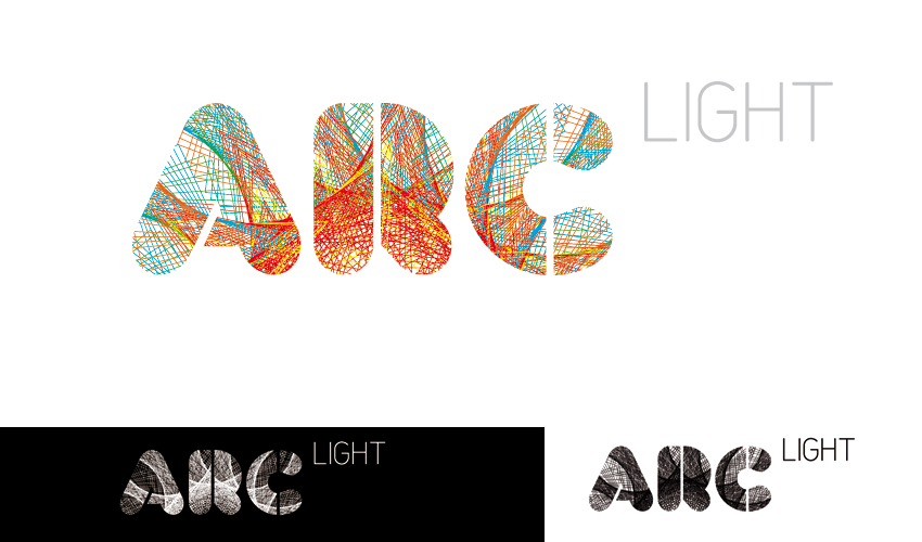
Pitching this little sucker to a homeless shelter manager next week.
The building is new and very modern. Opening in March and causing a lot of controversy in the city. The person briefing us is very open to a different outlook on shelter branding. The shelter is more of a schooling/get back on your feet/change your life centre. I've stayed well away from the roofs/doorways/hearts used in pretty much all other shelter branding. The logo is aimed more at council members, business' and press than the actual homeless.
The building is split into 5 coloured sections which have been used in the kada font. The idea behind the actual logo is the spark and energy of inspiration and change that the people can make for themselves. Also changing the fabric of our lives could be used (Afterthought?!). The 'LIGHT" in variable worked better un-aligned due to the round edge of kada.
This is the first time I have posted any work on here so all comments/abuse would be great...