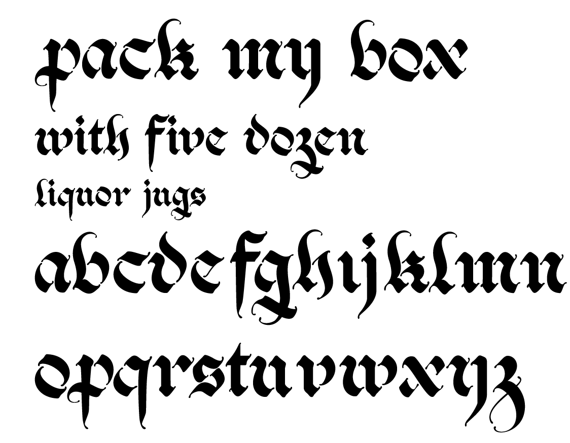
Hi My name Is Charles and I’m a design student at Kutztown University. I did an independent study this past semester on typeface design because no professor at my school teaches it and I wanted to try it.
This was the result. I was wondering if you guys wouldn’t mind critiquing it. I built it in illustrator because I haven’t the slightest idea about anything that professional type designers use. I used some rulers and built some tools out of boxes that i thought were quite resourceful but I don’t know if I even did the right thing once and not everything is exact because I wasn’t sure where to even start that.
The books I tried to use were: Karen Cheng’s “Designing Type” and “The Art of Calligraphy” By David Harris because it had all different written alphabets including the fraktur.
I based it off of my own letterforms of the fraktur but it went in some different directions. There are a lot of things that interest me and disturb me and I don’t know how to fix them.
What do you think?
http://farm3.static.flickr.com/2074/2165307545_ed6f38079b_o.png