Typophile

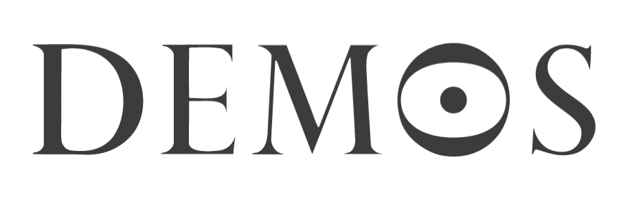
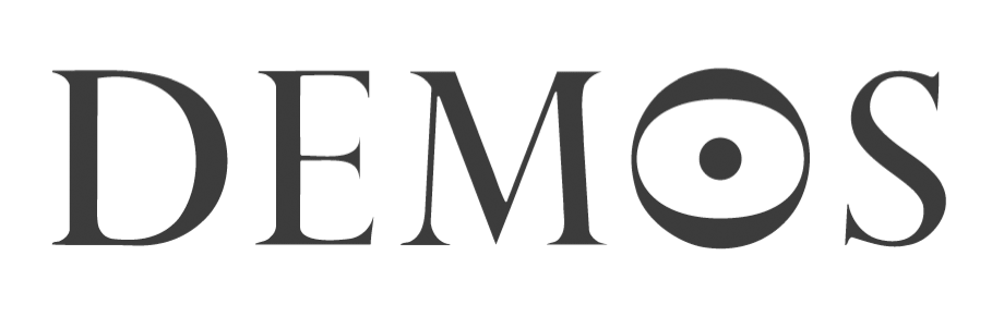
(x) Demos delicate serif logo - Perpetua Titling {Florian}

modernactivity

Hi

We need to clean this logo up somewhat for use at smaller sizes, and were curious as to its origins... any help much appreciated!

Also here: www.demos.co.uk or here http://www.modernactivity.com/images/DEMOS_logo.gif

thanks

Matt

AttachmentSize
DEMOS_logo.gif16.51 KB

Hi Matthew,

that’s Perpetua Titling by Eric Gill.
F

Florian - thanks; good tip! It looks as if someone has messed a little with it (obviously on the 'O')- but this is close enough to work with. For some reason the serifs seem to disappear at the ends, which causes printing problems - now I can go back and adjust this to suit...

thanks for your time + Happy New Year!

Matt

> For some reason the serifs seem to disappear at the ends, which causes printing problems

I think they might have added a white outline to slightly "eat away" the outside of the characters so the serifs would become more delicate. And the O was simply tilted and a dot added at the centre.

Captured from web.archive.org on 13 Dec 2013. view this capture