Typophile

German Type Foundry (GTF) releases Toshna

Andreas Seidel

Toshna is a garaldic typeface design offering three real optical weights. The display weight for titles and headlines is kept very tall, thin and graceful. The book weight for body text is drawn essentially wider, more round with robust, bold details.

Toshna Std (characterset) is distributed by astype and MyFonts.
Toshna (Pro) is available exclusively through by GTF.

The printed specimen book is featuring an extensive article in English and in German about the type designer Herbert Thannhaeuser. The edition is limited to 500 copies.

Order your copy including an additional poster.

http://germantype.com/toshna
http://toshna.germantype.com
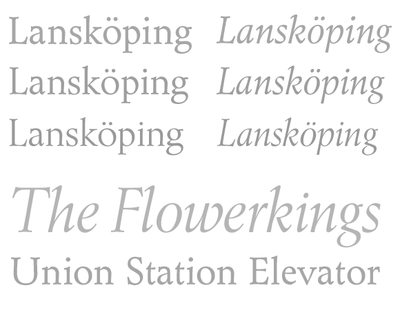
It's a lovely face, very elegant and finished, but you offer no bold and bold italic, and your price is too high for freelancers to purchase by themselves--and they are the taste-makers you want to target. This face occupies an especially crowded field, and competing faces are more complete, more extensive, and better priced.

It's not THAT outlandishly priced, and not everything needs a bold or bold italic. But that's just my opinion, and I'm not an art director or typographer...

Actually, every text-use family DOES need at least two weights, with matching italics, in order to attract wide use. Adobe's new Arno Pro, an obvious competitor in your "look"...just see how complete and developed that family is, and at a much better price! FF Clifford and H-FJ Requiem would be much bigger news by now, used much more extensively, if their foundries had finished their work and had released them with extra weights. This is not a small issue industry-wide.

@ John

Old thread, but I had a closer look to Toshna these days. Great typeface! With and without other weights. And Clifford is one of the very rare fonts, about which I would say, that they are perfect as they are. Clifford is simply an absolute masterpiece! Except from that I wonder, whether it is possible to create a worthy semibold partner for Clifford because of its darkness. Clifford IS finished. I really would not waste my time with creating semibold styles for Clifford just for filling an expectation of the market.

Captured from web.archive.org on 19 Aug 2013. view this capture