Happy new year and Hi everybody!
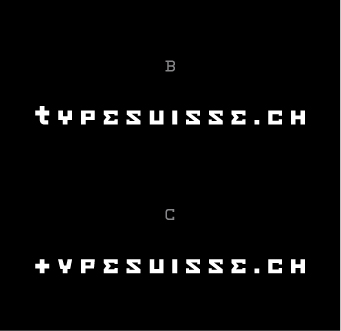
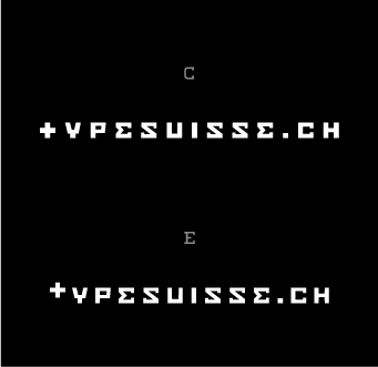
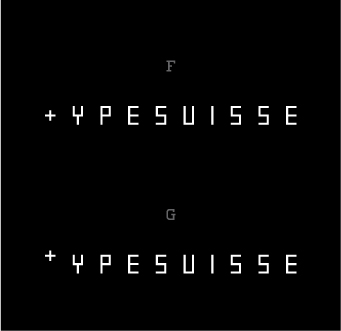
I'm working on my personal type foundry Logo. My foundry is called typesuisse, but I'll keep the .ch in the logo, because the whole thing is based as a website. I did a few sketches and I came up with this Idea.
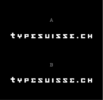
I started with the Letter T and combined it with a (swiss) cross. The cross T monogram will be used as Icon. Then I continued with the rest of the letters, trying to keep the thickness of the Monogram. As you can see, I got two different version. A has the simple shape of the grid I used and in B I tried to change the letter E and S, so it looks not like a laying capitol M and N.
I would appreciate if you could give me feedback.
Cheers!